
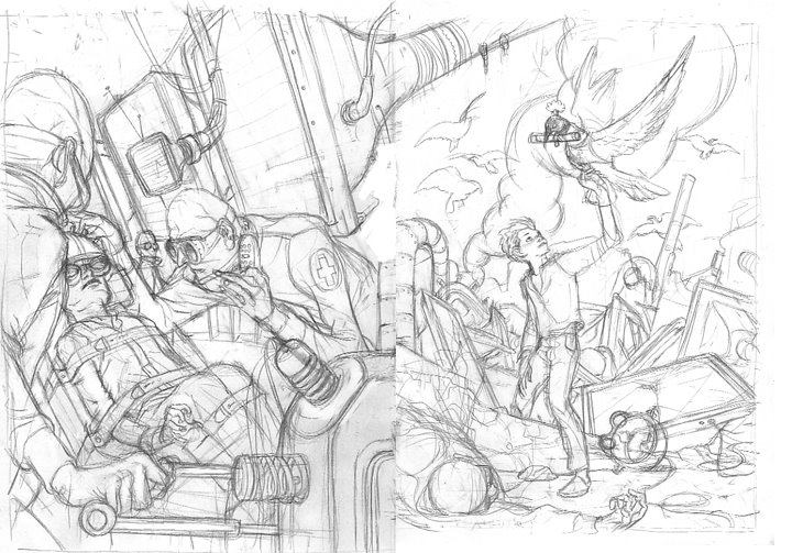
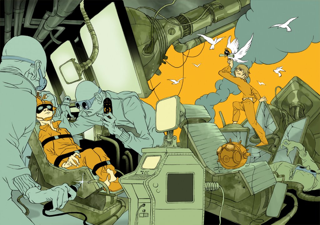
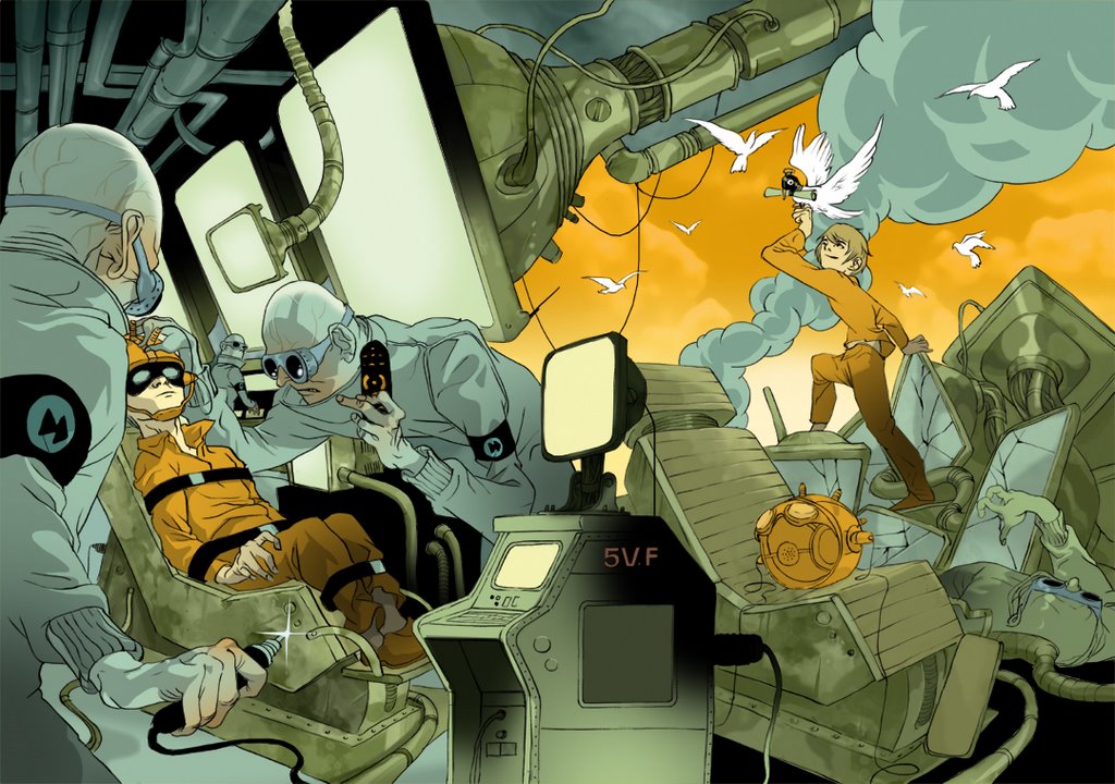
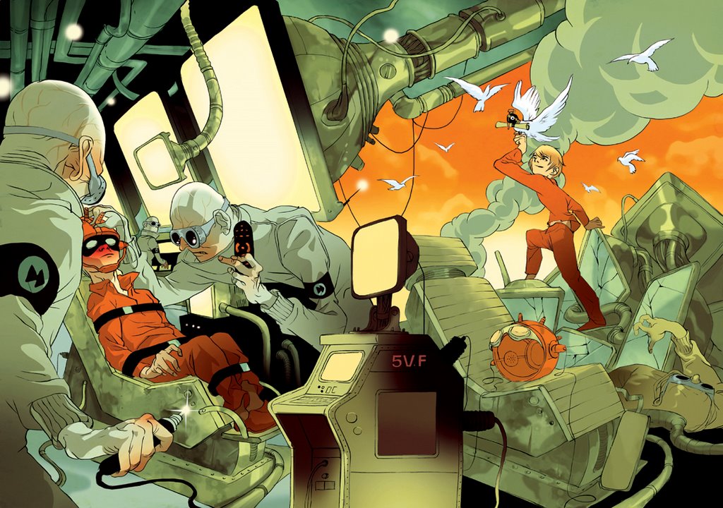
giving the subject a si-fi bent, a concept was cooked in which a boy is forced by corporate scientists to watch big screens and when he escapes his captures, a mail dove greets him to freedom. the client stressed that the front and back covers needed to continue the same space so it was a bit tricky getting a time continuation established. these are the initial sketches:

realizing it to a full size drawing it seemed the movement in the composition went nowhere.
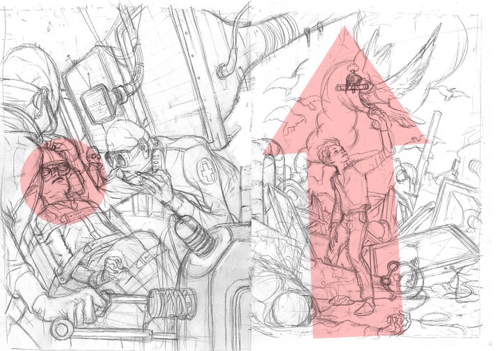
so the front cover was replaced, this time trying to work a diagonal in there that will interact with the back cover.
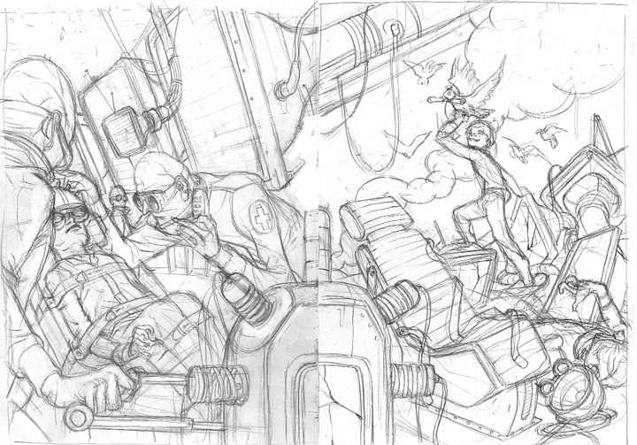

once this was approved the drawing was rehashed on a nicer paper and inked.

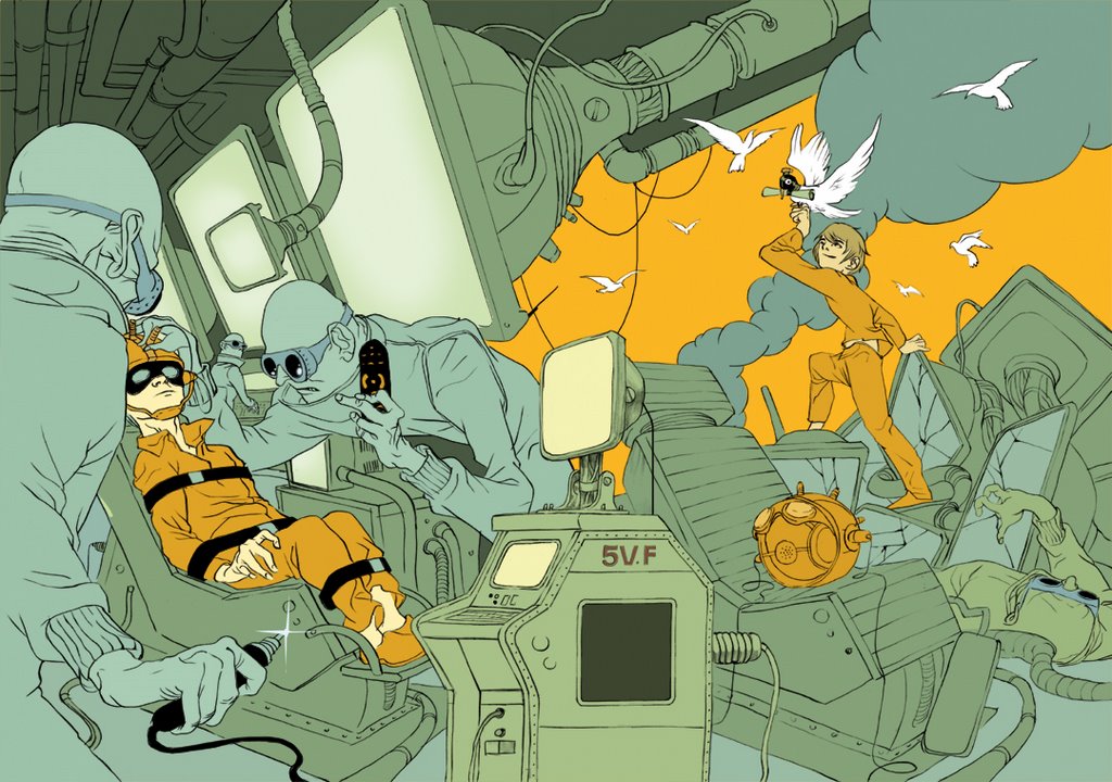
this bellow is the coloring, broken into a few stages. in reality it took much longer then it'll take you to scroll thorough them, and the color combo changed numerous times.


Great piece!
ReplyDeleteReally nice to se your process too. Very inciteful.
Thanks for sharing.
Great composition Tomer..
ReplyDeleteYour eye totally flows on a sinuous path through the whole drawing, hitting all the key areas of interest. Less is more with your palette. So simple and effective. Kudos!
-Jon Keegan
Wow,
ReplyDeletethis is a very interesting post, great piece. It's interesting to see your design process.
so so nice! I love seeing the process
ReplyDeleteThanks for sharing your amazing process Tomer, so clean! I love how you went about your composition and is so evident and so strong. Great textures and details at the later stages. The finishing touches really make it an incredible piece. Do you improvise towards the end or is every little detail planned out? Anyways, awsome as always!
ReplyDeletethanks for checking out the pilot tomer. It was really fun to be part of.
ReplyDeletein other news.... This illustration is awesome... then again, all of your illustrations tend to be awesome.
Beautiful coloring and texturing process here. Thanks for posting your steps.
ReplyDeleteWow, great work!
ReplyDeleteThis Blog is incredible, I am glad I stumbled onto it. Very inspirational.
ReplyDeleteI like it , as usual , but why them birds? , it is distracting.
ReplyDeleteThat is one awesome step-by-step.
ReplyDeleteAbsolutely love your work.
Great work as always.
ReplyDeletethanks for everybody who stopped by and left a kind note-- more updates soon.
ReplyDeleteI like how you show the stages of the coloring, and the thought that went behind the composition. great stuff!
ReplyDeleteGreat working with you Tomer. I'm Sending you some copies of Deliver in the mail. Sorry it took so long for me to get around to it.
ReplyDeletethis piece blows my face off
ReplyDelete