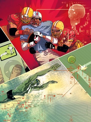
my basic idea was to somehow overlay digital elements on an intense moment in sport, more of a collage than narrative composition.
I started out with 2 thumbnails.
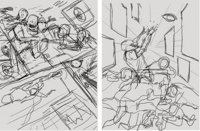
then reworked the sketches to a readable level. the sketch on the right is the traditional anecdote, a detail telling the story. the one on the left is a collections of different moments in sport, telling the story in fragments.
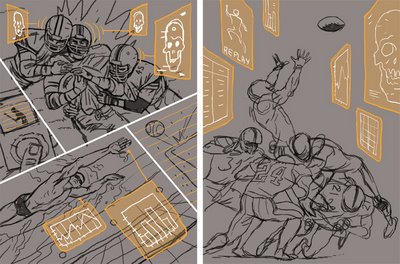
for the illustration concept, usually I go for the anecdote - one detail/moment from the over all story, represented as a visual metaphor of a textual content. since in this case the fragments concept was chosen, the challenge was to make the different parts work together.
as I started coloring the different parts I tried giving each frame it's place on the hierarchy of importance.
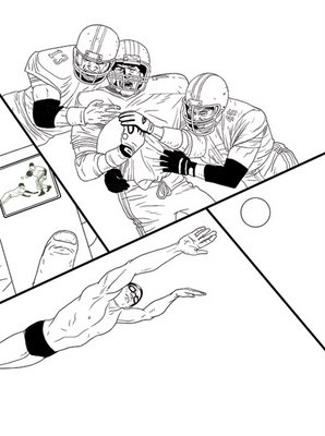
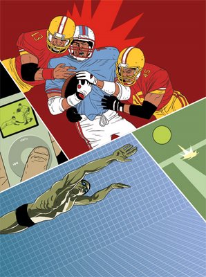
finally, some color balance and dropped the hi-tech pattern on top of everything.
maybe I just miss doing comics.

That's very cool. Love the way you left the swimmer without an explicit water surface.
ReplyDeleteGreat piece. The layering of textures and 'collaging ' of elements seems a slight departure for you stylistically. Nicely done.
ReplyDeleteLooks good! Did you model that skull somewhere? The high tech ellements seem to work for this one, though there does seem to be the slightest danger that the image will get buried in them. It's something, I think, you kind of have to be careful of--too much of this stuff and your work will start to lose the human touch since you're already drawing now on the tablet.
ReplyDeleteThese figures are terrific! Particularly like the expression of the football player on the right.
Speaking of comics--the swimmer would make a great superhero. Makes me think of you and Tomer's Batman story in the Bizarro Collection! That was fun, seeing you guys mess with a franchise property. Love to see you try something like that again...
The fractured image looks great and the technology stuff adds some very nice depth. I wish that there was either more red in the bottom half of the piece or some greens in the upper panel. The balance between the compliments is a little off. Other than that great piece.
ReplyDeleteGreat piece man!!!! I have been seeing you get better and better with your over all work and the finished pieces just feel solid. This one is an example. I think from a design stand point using the computer diagrams and to make it look like a computer analyzing the action is perfect. The way I look at it this piece is published and just cooo.
ReplyDeleteKeep em coming.
-peace
Stephen
hey asaf -
ReplyDeletethis is soooo good. i love it.
it is so expresive and cinimatic.
you can almost hear the background sounds..
your work is always elegent and smart (sometimes too smart), but this piece is just right. it has an amazing balance and coolness to it. the compostion, the coloring, the depth - the thumb on the ipod, the water polo ball.
everything.
very very nice.
this one is soo good, i love the composition. and it s so good for me to discover the process from the first sketch to the final work. thanks for sharing your stuff, it s usefull for learning.
ReplyDeletegreat work!
ReplyDeletejack noel - thanks. I did try going for some painted water effect... but didn't managed to pull it off decently.
ReplyDeletedominic - you might be right, I do that more and more often, it's a handy solution for bringing together two completely different elements.
jed - just got my Bizarro copies in the mail! Jim Campbell did great work on the colors. you are correct about the danger of covering too much of the drawing, but personally I feel the drawing itself has no real significance, only as a vehicle to express an idea.
macworkerbee - interesting remark. I agree here. the tights on the swimmer could have been red.
bluebird - thanks for the kind words dude.
naama - I really appreciate this coming from you.
pedro - thank you
pabloesoto - welcome to tropical toxic!
albert - thanks.