
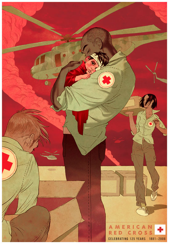
 tomer :: when the American Red Cross invited me to create an image for it's 125th anniversary celebration my gut reaction was paralyzing fear. the Red Cross has a long and respectable tradition of art, including some old and contemporary masters like Normal Rockwell, N.C. Wyeth and Richard Avedon.
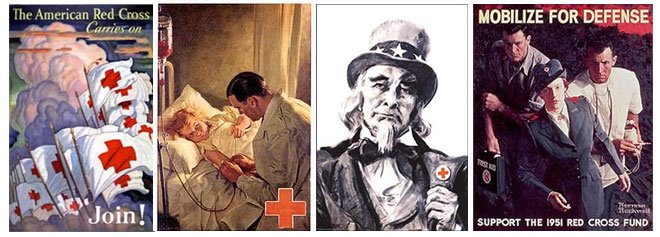 during the research I was struck by a photo of a man embracing a woman (and a similar one of a man embracing a child) thinking there was an interesting relationships in the way the shapes seemed to compliment each other. this became the central idea for where the sketch was heading.
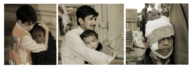
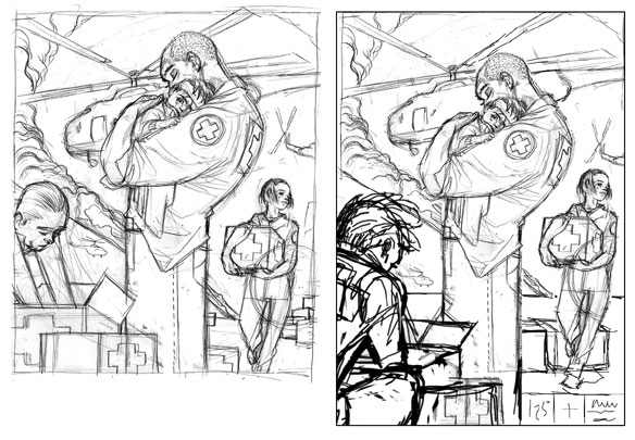
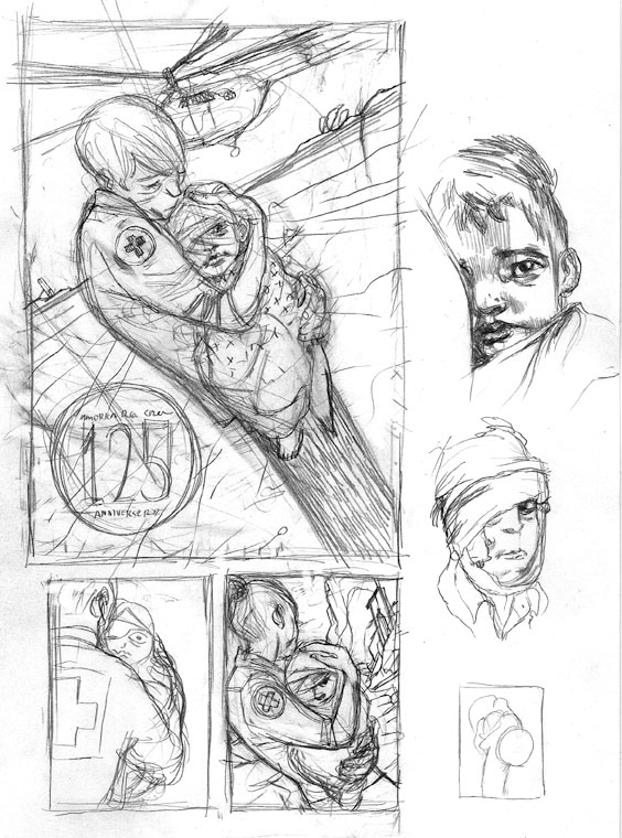 the sketches didn't look right as the man didn't seem like he can carry his own weight, I had to go back to small thumbnails and rethink the composition. from there I developed a second larger sketch and then extended it's height and turned the man in the lower left corner away from us so his face don't become another source distracting our attention.
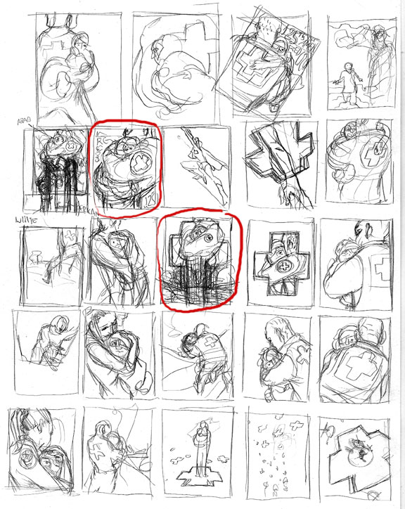
 I went through a few different color combos, starting with blue and gray and moving from there to this, trying to keep the 'disaster' atmosphere present but not overbearing.
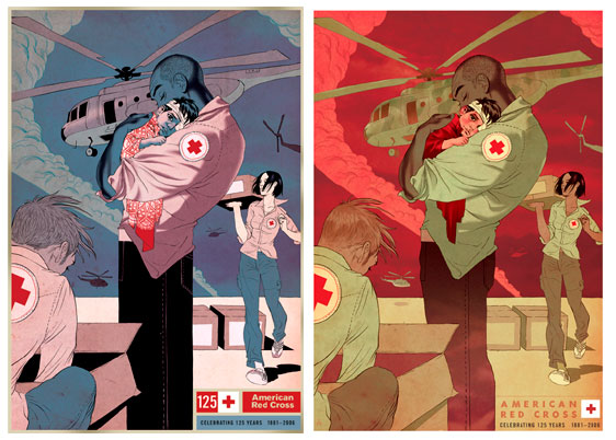
Your final design looks amazing!
ReplyDeleteFantastic. Thanks for sharing your process and why you made the choices you did.
ReplyDeletewow, you did a phenomenal job with this one. great colors, atmosphere, etc.
ReplyDeleteI've learned so much from your blog so far...thanks for sharing your process. The final illo for this rocks!
ReplyDeleteGreat of you to share the process. Very nice solution. Though I'm partially to the tilted camera in the earlier iteration. :)
ReplyDeletethanks everybody!
ReplyDeleteThe way the faces look and the girl in mid step gives it a snap shot feel. I like it
ReplyDeleteExcellent poster, Tomer. These complementary colour schemes are all yours, and it's interesting how you turned this one around for a totally different mood than you might usually invoke. -- I noticed the rather elaborate pattern that you had worked out for the child's blanket and then deleted because it distracted from the overall effect. Who the heck was the artist that said you have "murder your darlings," anyway? It was just this sort of thing that he meant. -- Properly executed, all around.
ReplyDeleteWonderful piece, made even moreso by seeing the evolution of the project. It would be mean to steal a Red Cross poster if I ever saw one, but it's tempting!
ReplyDeletebrad- I'm generally all for patterns, and I wanted this to have an 'ethnic' feel, but in the end it was a distraction, so yeah definitely 'edit out your darlings'. hey there are some fine lines on your art blog! very slick.
ReplyDeleteedco- hey I hope they will give them away somewhere... ;o)
joshua- thanks!
Extraordinary work!
ReplyDeleteIt's cool! I'm taking it to my blog. Hope you don't mind. I credit you, obviously
ReplyDeleteBut why are copters look like russian?
ReplyDeleteBlog is so good where i get lots of information nice job!!
ReplyDelete