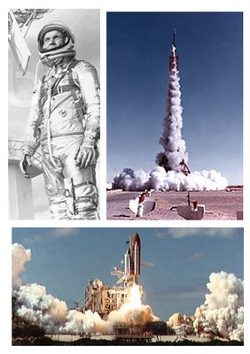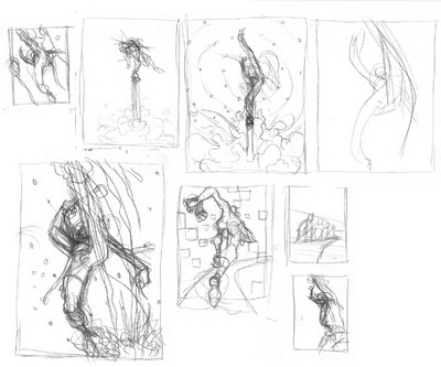
there is a very familiar image of a space shuttle launching away-- a blinding light followed by a smoke trail aiming at space-- but what if this trail was coming from an astronaut's boot, instead of the shuttle's engine?

and to turn this into a race, two more runners joined the setting, all going in full steam.

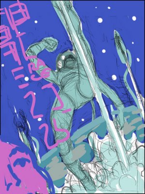
since this aimed to be a poster the colors needed to be simple, dividing the space in a clear way. I wanted a cool pallet for this outer space experience.
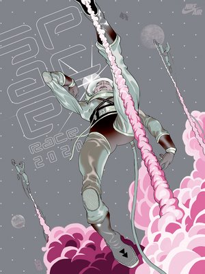
and here is the final. decided to go with an even cooler palette trying to get that metallic edge, taking the humanity out of the equation as much as possible.


hey Tomer!!! man your stuff is looking great!! i just thought i'd check in with you. this is dan mendoza. we worked together on that MTV animted station I.D. a while back. What happend to that thing any ways? it'd be good ta hear from you. cantact me on my web site.
ReplyDeletehttp://toxiccandie.com/
see ya later.
This is a great blog, both you and james jean worked on the same nike space project. Both really good. Interesting to see the differences and similaritys. keep up the great work.
ReplyDelete-dave
This is a great piece! The composition and the viewpoint really make this standout.
ReplyDelete-J
Nicely done , love the color scheme too.
ReplyDeleteI hadn't checked out your site in quite some time; glad I did. I like the soft edges of your colors inside of the rough lineart. I sort of do the opposite, most the time.
ReplyDeleteI tend to use the same aparati I used to ink the outlines to fill in and then halftone the colors. Time consuming, though!
great work, as always i am really impressed by ur creation, the sense of actiona and rithm of the compositiona nd characters is great.
ReplyDeletepaolo
cool concept! and the colors work really good. Maybe some pink on the type would of been nice.
ReplyDeleteOverall lovely colors and finish.
ReplyDeleteMinuses...the pose is not as dynamic as it could have been: the body parts closer to use could have been larger using a more foreshortened perspective, the original sketches convey the spirit of the pose better than the finished one, astronaut feels very skinny and gangly, which is the opposite of what most astronauts look like in their suits (except if you're going retro). And...not keen on the pseudo-futuristic typography which seems not as well considered.
I think its not as strong as some of the past work I've seen, but still very good.
Haha...that sooo much fun. I love the limited palette too. Complementary colors all the way man!
ReplyDelete=s=
thanks everybody, good pointers across the board.
ReplyDeleteToxic Dan! - good to see you're doing well, great site!
Some quick notes/crits: you're at your best, subject-wise, when you're doing political work. That's because the real you shows. In commercial work you're too literal and you lack sex appeal. Put some of you in commercial assignments - your draughtsmanship is perfect and your palette elegant (although lacking contrast on weaker pieces). Consider the James Jean piece on the same subject - he directly injected his own current interests into the project, instead of interpreting the brief literally.
ReplyDeleteit reminds me of the futuristic stuff that was going around during the late seventies and early eighties in the euro comic scene. Love the colors, Tomer.
ReplyDeleteThis comment has been removed by a blog administrator.
ReplyDelete米蘭情趣用品,情趣用品,情趣,飛機杯,自慰套,充氣娃娃,AV女優.按摩棒,跳蛋,潤滑液,角色扮演,情趣內衣,自慰器,穿戴蝴蝶,變頻跳蛋,無線跳蛋,電動按摩棒,情趣按摩棒
ReplyDelete辣妹視訊,美女視訊,視訊交友網,視訊聊天室,視訊交友,視訊美女,免費視訊,免費視訊聊天,視訊交友90739,免費視訊聊天室,成人聊天室,視訊聊天,視訊交友aooyy
哈啦聊天室,辣妺視訊,A片,色情A片,視訊,080視訊聊天室,視訊美女34c,視訊情人高雄網,視訊交友高雄網,0204貼圖區,sex520免費影片,情色貼圖,視訊ukiss,視訊ggoo,視訊美女ggoo
080苗栗人聊天室,080中部人聊天室ut,ut影音視訊聊天室13077,視訊做愛,kk777視訊俱樂部,上班族聊天室,聊天室找一夜,情色交友,情色貼片,小瓢蟲情色論壇,aio交友愛情館