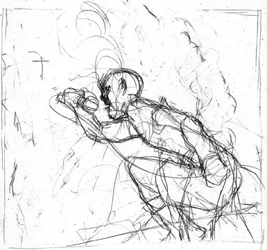
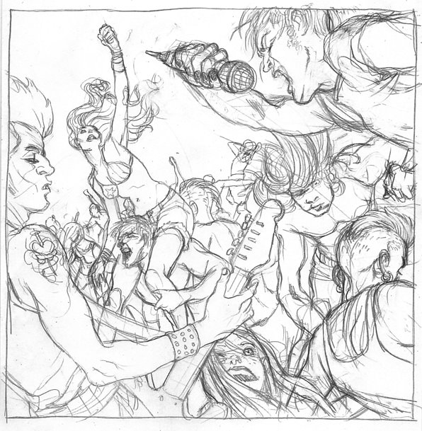
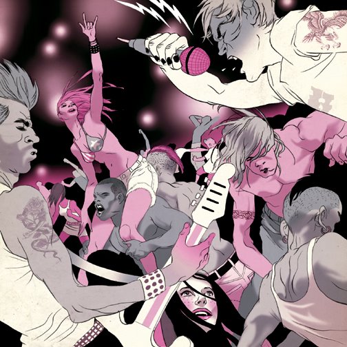
tomer :: this smallish 6x6er was created for the Chicago Tribune about Lollapalooza, the famous three day long rock concert. the brief went for atmosphere rather then any specific band and my initial idea was to flip the classic composition of a band in the center framed by endless crowd -- so you get the crowd in the center, framed by the band.
Inspiring as ever. I recently tried to do a similar thing, but for a festival too small to focus on one band. I composed it with the camera behind the drummer, with all the info on his tee. It actually turned out a bit shit. This is brilliant.
I've been spotting your work in the outside world witout even having to see your name on it (Playboy, Wired). It's great to see an artist with such a unique graphic style in great mainstream publications.
Keep posting the step-by-steps of your process. I loved the break-down of the Marquis de Sade piece!


Inspiring as ever. I recently tried to do a similar thing, but for a festival too small to focus on one band. I composed it with the camera behind the drummer, with all the info on his tee. It actually turned out a bit shit. This is brilliant.
ReplyDeleteNice one! Doing multiple figure compositions is always a challenge , you pulled it off nicely.
ReplyDeleteAwesome man, I found your site after seeing this in the paper. Too bad I couldn't go to Lollapalooza, but this image makes up for it nicely.
ReplyDeletethanks ! we're gearing up and stepping on with new updates soon..( 8-->() } (<--self portrait).
ReplyDeleteI've been spotting your work in the outside world witout even having to see your name on it (Playboy, Wired). It's great to see an artist with such a unique graphic style in great mainstream publications.
ReplyDeleteKeep posting the step-by-steps of your process. I loved the break-down of the Marquis de Sade piece!
The self portrait is genius.
ReplyDeleteRidiculous! I love the color scheme, and the girl on the bottom.
ReplyDeleteGreat composition. My only quibble is that the grip of the guitarist is pretty unconvincing...looks like he's going to drop the guitar.
ReplyDelete