
I did two sketches presenting a sad teen clicking away while a morbid stranger is next to her, masked with the smily icon.

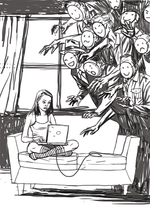
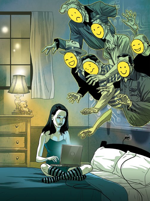
they chose the second sketch, but asked for a change - the teen should be in her bedroom, to enforce the fact parents are not around. so suddenly the characters on the right had no space to emerge from, no vogue darkness. as a solution, I made them bump out of the wall, and added a hint of an electronic circuit, just to convince everybody everything was intended.
Nicely done , though I find the 'creepy' factor more evident in the first sketch.
ReplyDeleteThe final execution looks great.
Really nice piece. I think this is a solid way to show how the net is. You have people coming from all over at once to try and take advantage of you. Really nice touch with adding the different smile faces haha I love the first sketch but its not as strong at getting the feeling of what the web can be.... Take it easy nice job. -peace Stephen
ReplyDeleteYour sketches are so free and I am envious. When I sketch on a Wacom I am always disappointed. Would you share with me your tablet settings, ie. pressure sensitivity and so on please?
ReplyDeleteThanks, Jack.
England.
Very nice illustration. Great colours, and pure, clean lines. Nice mood. But I have to say I prefer the first idea. The one with less "crowded" net. I know it's not the way it looks, there's hordes of bad guys out there, but intimacy of first scene is even more frightening for me. The second picutre is about nameless, unknown, faceless danger (like zombies, they're terrifing, but something not real), while first one tells the story of real evil...
ReplyDeleteAnyways, great picture!
thanks for the comments guys!
ReplyDeletedominic - I guess there is a fine line between "creepy" and "too creepy", or maybe it all depends on the people who are looking. in the case - worried parents.
bluebird - true, something is very misleading about the web experience - a sense of intimacy at the most crowded place on earth.
pedro - still looking for a way to capture that special energy of the first stroke. it's a journey of a lifetime.
jack - on the tablet preference the tip feel is exactly in the middle between the "soft" and "firm".
on photoshop I use the brush tool set to 50% opacity. on the little brush preference window the "shape dynamics" and "smoothing" boxes are selected.
and one more advice - try to draw fast, it may sound bizarre, but it helped me a lot for the transition from pencil to wacom. hope this helps :)
miras - interesting point of view. maybe the true evil, such as a middle aged man touching a teen girl in her bedroom, is too much for the viewer. sometimes we need to wrap our fears with a little b-movie cliche just to make them more bearable. it's funny you said it reminds you of zombies. someone else told me it reminds him of the holocaust. go figure.
this is a wonderful piece. I think you've captured the eri mood perfectly. I particularly like the fact that the smiley masks are so simple against all the other detailed areas of the scene.nice one.
ReplyDeleteIt's interesting that the wacom has been brought up.I'm a tablet virgin and I've been on the lookout for a tablet and i still can't still decide what size tablet to purchase. Can you recommend a size that would be appropriate for illustration work?
hi dru - I use the simple wacom sapphire, format a6, but recently I hear more people claiming the larger ones are better, so my best advice would be - go to the store and try different kinds and then decide. good luck!
ReplyDeletereally great work!
ReplyDeletei love th color chice, and the girl. also- it is very Neil Gaiman to me. did you hear about the exhbition of Gaiman ? towards his arrival in Sukot ?
ReplyDeletesteve - thanks :)
ReplyDeletepillit - gaiman? exhbition? sukot ? I lost you there.
as you (both) gain more reputation for your talents, does your opinion in the art direction also increase? how often do you get asked "what do you think?" and have you given your personal opinion on the ethical content of your illustration as well as the actual art?
ReplyDeletethese are high profile pieces that are seen by many and in no small way influencing your nations culture and collective state of mind.
example in the last two posts the art director was/is obviously playing on peoples (parents) fears to sell the piece, this is the part of commercial art I still cant handle, having to give way to forces from the finance dept.
the illustrator, unlike the artist, is there to provide a visual metaphor for a textual content.
ReplyDeletethere is a difference between "scaring people" and using scary elements as a vehicle to express an idea. a good illustration will provoke an emotional response of some sort, otherwise it will be ignored, therefore irrelevant.
and if you can't handle it, don't blame the finance dept. ;)
I really like the bedroom change actually. And I also think that creeps coming through the wall is scarier then just out of the shadows. This is the strongest realization of the concept I think, very cool! Both you and Tomer had evil masked computer man assignments recently-- nice twin synchronicity there.
ReplyDeletehey - thanks for the post on the meathaus blog!
ReplyDeletetrue about tomer and me doing similar conceptual work here, all because of those damn comic books we used to read :)
This is excellent! Its nice to see your thought process and such. Great concept & execution. Im a big fan of you and your brother.
ReplyDeleteThis is real awesome! cool concept, love the sketches. Nice to see the progress!
ReplyDeletewow... i'm totally mesmerised by all your work. i especially love the brutal ones.
ReplyDeleteno updates anymore?
ReplyDeletehttp://www.apple.com/trailers/miramax/renaissance/trailer1/
ReplyDeletei think you're going to like this.
Is it based on a franch comics?
hey all,
ReplyDeletethanks for the comments.
it's been crazy on both sides of the ocean, but finally we are back and a MAJOR update is being prepared.
stay tuned... :)
My favorite part about the illustration is the use of emoticons on the faces of the net-predators. My least favorite is that I have a college-aged daughter who "chats" with dozens of netizens at once...
ReplyDelete