
it was pretty clear from the begging it's going to be old tradition vs. pop culture.
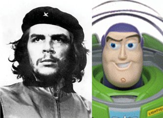
after doing couple of sketches I went for the most symmetric composition to enhance the "versus" motif, while using the character to draw the border between to two clashing elements.

then for the tight sketch I noticed a drop of white paint in the right place could suggest a tear, but only visible to those who will take the time to look closely. like a trophy of sadness.
for the execution I spent most of the time throwing in textures to make it look dirty.
A really effective, iconic image, and the use of black on the figure is really nicely done. You're good with those spot blacks--I think if you lean more on your strength with the spot blacks, it'll give you a stronger, more unique illustration identity. You do the open line stuff well, but those nice confident blacks really distinguish you from Tomer. Not that this is a Tomer vs. Asaf competition, it's just nice to see you assert one of your big strengths.
ReplyDeleteI always admired the use of black by masters such as Braccia, Munoz or Mignola, but had hard times applying it in my work due to fear of messing up. working digitally has changed that a little, and I am able to take more risks.
ReplyDeleteEmbarassed to say I'm not familiar with Braccia, (what's the first name?) no doubt he's someone I should already know well. I am a serious Munoz fan, however. He makes it look effortless. I remember as a kid being into Kieth Giffen's poor impersonation (and sometimes outright plagiarizing) of Munoz, but always finding something missing. Then I discovered Munoz! It was this major revelation!
ReplyDeleteAnyway, don't cut yourself short. I've seen you use black really effectively in your comics work. If the computer helps you to become more bold, great!
I find that black and white line art takes more precedent with your work than in Tomers. With some exceptions, Tomer tends to use that line drawing as a foundation to really paint the image. Yours read more as colored drawings to me, which isn't at all a weakness--it's just more where you tend to lean, and I think fleshing those drawings out with some rich blacks is really going to give them life. While Tomer tends to use black more as a shape, you tend to use it more as a shadow, and the next step may well be to really give your drawings the 50/50 (or more) black to white ratio treatment. I'll be looking forward to seeing where you head with it, one way or another.
jed - Alberto Breccia, who was actually Munoz's teacher, claimed that light erases contours, while shadow swallows them. therefore, he used lines almost exclusively for creating textures. otherwise, his drawings were made of black and white shapes, in both an expressive and realistic manner.
ReplyDeletehere is his labiek web page :
http://www.lambiek.net/artists/b/breccia.htm
paolo - thanks for your kind words :)
very nice work, and always a joy to be able to see the work in progress , as for masters of b/w don't forget Hugo Pratt and Milo Manara.
ReplyDeletetxau
true, Pratt had a spectacular talent for depicting monumental landscapes with couple of expressive brushstrokes.
ReplyDeleteas for Manara - I don't know about the b/w thing, but damn, they sure are sexy!
i just have find this blog, it s great. im really amazed, and i also find this comments about alberto breccia, great, im from argentina and i ve been cheking his work since i started to try drawings.
ReplyDeletei ll continue visiting this place.
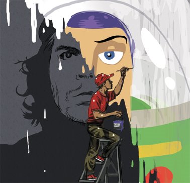
I like this one a lot....love the shadows on the figure painting the wall
ReplyDeletewonderful pieces! Especially the illos!
ReplyDeletehey pablo - I think Breccia is extremely underrated in the u.s. not even sure his work was ever translated to english. I got a french edition, luckily.
ReplyDeletejosh - while working on this I was actually thinking about your work, because you always have those stylized "paint drops". thanks for the inspiration.
thomas - wow, impressive work on your blog, I admire the fluidness and liveness of the characters.
Really great piece the play of the two images together makes this a solid piece. I really like the graphic design/ layout of this image. I love to see images that have design elements to them. Keep up the great work!!
ReplyDelete-peace
Stephen
"it was pretty clear from the begging it's going to be old tradition vs. pop culture."
ReplyDeleteActually, it's just painting one Mickey Mouse icon over another.
stephan - thanks. I agree about getting graphic design into illustration, I wish I could do that more often. I think Lorenzo Mattotti mastered that in his illustrated posters.
ReplyDeleteanon - stop insulting Mickey
I'm glad you found our blog. I heard of you and your brother's work last year, but haven't seen much. Now I can see more, and talk more about twins working in comics.
ReplyDeleteGreat pictures, by the way.
i l-o-v-e this one.
ReplyDeletereally greate work!
einat