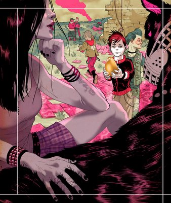
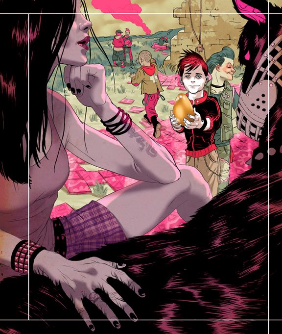
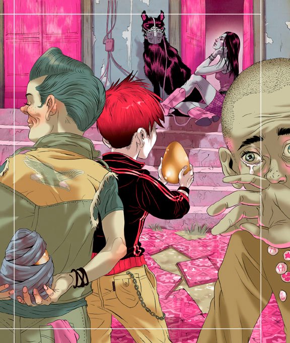
tomer :: the girl is ice-- she is colored in a cooler palette than the boys. the main kid is a redhead so we know that's where the action matters the most. the floor tiles are a texture from a Dover book that came with a CD. the girl's skirt is ready-made pattern found online. the white guides are where the bleed starts and they needed extra bleed and even more extra for the super thick spine. an idea to have the gold-egg be a 'real' gold embossed was discussed, not sure how it'll end up with the production though. and despite myself I ended up pink again.


There is a word that I used a lot in the 80's to describe this kind of work. So I will break it out for a one time only appearance in the 21st century....Awesome.
ReplyDeletethe golden egg kinda reminds me of charlie and the chocolate factory. Don't worry pink is this years black....
ReplyDeleteJK
very awesome work i love your color palete it seems like a surreal look to the image
ReplyDeletedevotion- :) the 80's are slowly turning into what the 70's were during the 90's. will doc martin's ever return with a vengeance? not on my watch.
ReplyDeleteanon- i hear the new black is corduroy... ;o)
alebrije- thanks man, i think it's the pumped up pastel-ish colors that gives the surreal look...
nate- looking forward to your online portfolio. i use Photoshop to color the linework, which i believe is the dominant application for this type of work.
Hi, 你好, nice to meet you
ReplyDeleteyour sketch amazing.