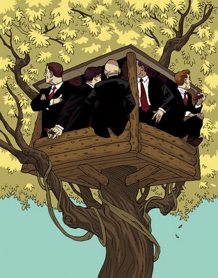
asaf :: I hate when this happens. after finalizing the color (top version) I couldn't shake the feeling something was missed along the way. had to go back and rework everything towards a more contrasted result (bottom), only to find out I wasn't sure which version should be sent. I ended up sending the first version (top). I guess sometimes a detour is necessary, even it ends up in the trash.


i really like the color scheme of the second one, but i think the first one gives a better sense of atmosphere and conveys more of a tangent environment.
ReplyDeleteagreed, i like the first even better, but the second seems more fit for a cover.
ReplyDeletejon - I totally agree.
ReplyDeletediddy - right on. it's one of those cases where both version has one strong element, while missing another,
thanks to both of you for commenting :)