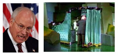
tomer :: all the yellow brick roads lead to Dick Cheney, or so it seems from the unfolding CIA leak scandal. when conceiving this cover for the Progressive the art director suggested playing off a scene in The Wizard of Oz where we discover who is the wizard, the one pulling the strings behind the curtain. only here the wizard is Cheney. this would reflect the magazine's (and what is wildly believed) reasoning on the course of events leading to the war. the challenge here was to tap into the viewer's memory of that scene in the movie and to make Cheney recognizable. another challenge was to have this image wholesome-- as if they all exist in one world-- despite the obvious cultural paste-up job. after a quick research (i.e google) i found this pic of that curtain scene in the movie, and Cheney's face.
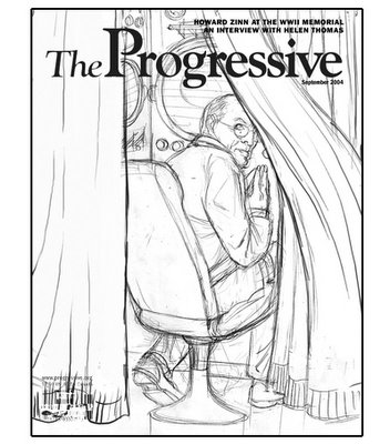
first sketch :: art director (justly) wasn't convinced about the environment being recognizable as The Wizard of Oz.
I tried another sketch where you see Dorothy and a flying monkey.
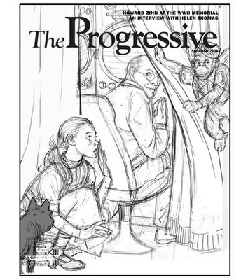


i really liked the one with dorothy and the monkey, great drawing either way tomer.
ReplyDeleteI love watching the evolution of your pieces from sketch to finished.
ReplyDeleteIt's great seeing someone of you and your brother's stature putting up this work for the rest of us to learn from.
I think Dorothy and the monkey is a big help and that you should go with that one. Hope the Art Director feels the same way.
ReplyDeleteI feel the exact opposite. I think less is better. You're assuming that the audience for whom the magazine is written for will not see the correlation without putting Dorothy and the monkey in it. I think the art director needs to give the audience more credit. I mean look at the front cover "WWII Memorial" story and an interview with Helen Thomas. I think the people reading this magazine will understand the man behind the GREEN curtain is homage to The Wizard of Oz without screaming "HEY LOOK DICK CHENEY IS THE WIZARD!!!"
ReplyDeletei'm much preferring the first sketch. surely the art director will realise that the color will bring it all together. adding dorothy and the monkey makes it a bit too obvious.
ReplyDeletei can't beleive the amount of work you guys post up, are you constantly working on new pieces, or are some of these from a while back?
jon- the art director felt the second one was better too, and i agree.
ReplyDeleterob- I'm glad you're enjoying the process!
anon- seems like that was what most of us felt.
devotion- i think if this was a more contemporary movie, and keeping in mind that the folks reading the magazine are not necessarily super visual, maybe a little help might be useful-- just in a sense of taking it out of the "riddle" area and into the "immediate recognition" safety bunker.
matt- it's a mixed bag, most of the work is real time, some is a bit older but the rhythm is about right. i think most working illustrators need to produce about 3-4 jobs a week to stay afloat- some weeks you get a job a day and sometimes you watch reruns of Law and Order.