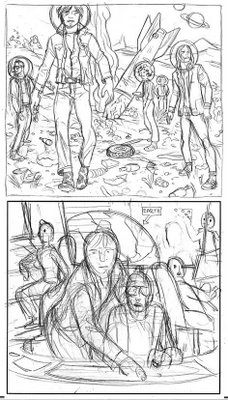
tomer :: the art director doesn't feel this approach was compatible with the band's vibe and suggests a more gritty si-fi look (like the Matrix or Blade Runner). we discuss my original idea of them sitting in the main-deck only make the ship super rusty, dirty and with exposed cables everywhere. also, he feels that people might assume the star trek uniforms are a 'new look' so we should keep them in normal hipster uniforms instead. i redraw the first sketch and another very rough one of the main-deck idea.


Great sketches Tomer.
ReplyDeleteOh screw the art director...the visuals of The Strokes in Star Trek uniforms would be far more effective.
ReplyDeletejon- tnx :)
ReplyDeletedevotion- on a gut instinct i tend to agree-- but there is a point to be made about the strokes being cool and scruffy (in a polite way) rather than silly and playful... maybe a band like weezer would work better with that uniforms, i don't know.
also i got to ask- i mailed that drawing (of the sushi eater in your profile) to someone a while back...it wouldn't be you by any chance?!
Yeah I'm the one who bought your Sushi drawing...unfortunaly my wife has restricted my art budget (we have run out of wall and storage space) but I've got my eye on several more of your pieces. And I still think The Strokes would have looked better in uniforms...it never seems to be about the music anymore just the clothing?!?!
ReplyDelete