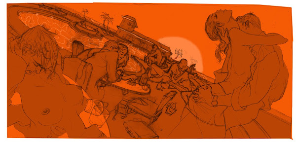
T :: this would have been disturbing if it wasn't so prevalent. They took the bailout cash, pocketed it as bonuses and blew it on coke and whores in Vegas. The 1st sketch had to be cleaned up somewhat, to keep it classy.
Double spread, art directed by Rob Wilson.


1st sketch is awesome--too bad you had to clean it up.
ReplyDeleteBut the final product, as always, amazing. Keep up the great work!
(BTW, props on getting work with Playboy)
Well hey - at least they're putting it back into the economy. Isn't that Reganomics?
ReplyDeleteThis is class, definitely a favorite!
ReplyDeleteThese people...these people are doing nasty things ! My God !
ReplyDeleteGood work :-)
Nicely conceived & executed.
ReplyDeleteYour line work and composition are incredible, as are the figures that you render.
ReplyDeleteawesomemness ~!
ReplyDeleteAmazing...great composition, impressive choice of colors as always. May I ask if the lines are digital? thank you!
ReplyDeletedrawing done with ink/brush on bristol paper.
ReplyDeleteis bristol paper the same as bristol board?
ReplyDeleteamazing!
ReplyDelete@flourescentwave-- I'm using Strathmore 500 Series Bristol, it's a 100% cotton Bristol paper (plate surface).
ReplyDeleteCame out great, Tomer. Love the palette as usual. Also the new design of the blog looks awesome too. Very image-oriented.
ReplyDeleteits great seeing some of the process.
ReplyDeletei really enjoy your work-can't wait for your next post!
I almost wish you had kept more of the orange in the final version. The sketches look like the bankers have been going all night and the sun is rising on their strippercokefest. Although the final pallete does have a surreal look to it which is nice. I enjoy how the bankers are all brown and the strippers orange too.
ReplyDeleteThe colors, the movement, the compostion. You rock. Haha, it's so funny to see how you cleaned it up. Maybe it was too shocking, if you see a man throwing up and stuff.. but i think it's cool.
ReplyDeletei like boobies
ReplyDeleteGreat composition, great palette.
ReplyDeleteGreat Work! - also the first one which was a bit more "Sodom and Gomorrha" than the final one.
ReplyDeletefirst image is perfect.
ReplyDeleteshame you had to sell yourself out for a magazine though!
Simply the best! Real and elastic!
ReplyDelete