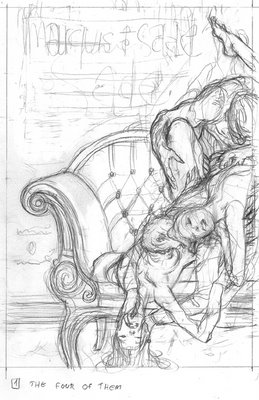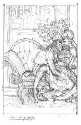
the cover had to be suggestive. it couldn't be too pornographic but also had to be loyal to the spirit of the text. these first two sketches are good examples of going over board, and then bellow board.


this one bellow hides more then it shows. having his hand up her dress could imply nasty things but in essence these are things that we imagine, nothing pornographic is actually drawn.

still there was a risk there, so this PG rated version was drawn, while completely loosing the soul or whatever it is that worked in the original doodle- the girl turned into wax, the man is Mr. Hyde.

the AD was super, he kept pushing me to do 'my thing'-- basically to interpret it from the guts, no pre-constructed concepts. then he went out there and got the better sketch approved. Since the cover included a back cover and two flaps there was lots of space to build a rounded atmosphere. the back cover is essentially the 'later' of the front, the front flap showcases an evil looking chandelier and the back flap has an excited horse. hoping i could get away with something slightly outrages I had the back flap and back cover create a suggestive bestiality situation that was quickly cleaned up when the horse got circumcised to the client's request

these are references i gathered during the sketch stage. i love the hair on this Victorian chick. I wanted to keep it minimal but give a good treatment to the elements that made it in. i rendered some parts with a pencil --the wood part of the coach, the hair, the wall panel. credit should be given here to the amazingly talented Zach Baldus who first showed me this technique and still doing it much better. the rest is ink.

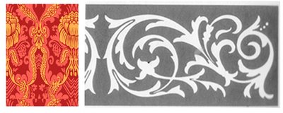
 I used these patterns (both from Dover books) to create the carpet. the red one was a tile that took most of the space. the black and white strip was the frame at the edge of the carpet- then I distorted them in perspective. the interior reference is a Boudoir, where this book takes place. i wanted to bring the warm and stuffy feel it has to the cover.

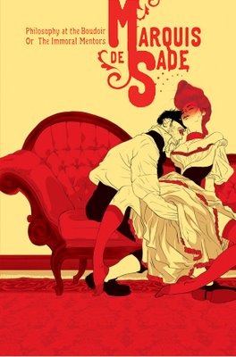
after coloring and placing the patterns. (the type design here is just some general idea i laid down-- real designers will take care of it).

this is the entire cover- the other parts had a similar treatment, some pencil, some patterns- you get the idea.

finally, I urge you to have a look at these smarter interpretations of literary classics by some of today's leading cartoonists.

This piece is great! I love the red chick on the floor. This is the kind of books that I would buy because of the cover.
ReplyDeleteI´m jealous of this!
Now this is covert Art.
ReplyDeleteAmazing. All great books should get the quality you provide here.
Lovely pieces. I especially like the bold color palette.
ReplyDeleteNicely done!
This is great. The cover, and the insight on the process.
ReplyDeleteExtraordinary!!
ReplyDeleteWhen's is out?
absolutely fantastic!
ReplyDeleteEverything I want to say can be encapsulated in a four letter word.
ReplyDeleteSimultaneously appealing and disturbing.
ReplyDeletea powerfully surreal juxtaposition of images, very unorthodox.
A de Sade cover, what an honor!
wow, LOVE the simplicity, feels very different from your other work. very inspiring
ReplyDeleteThis is brilliant. I love the colours- both of them!
ReplyDeleteMay I ask some technical questions?*:
1. When putting in patterns, are you using Photoshop's pattern brush? Would you mind detailing this process slightly?
2. When you use pencil to render areas, which is so effective, how do you exploit the rendering when colouring?
*I guess what I really mean is: 'Will you answer them?'.
wow tomer,
ReplyDeletei wish i could hire you to work with me on a book.
this is a truely amazing cover. the layout is elegent, smart and quite original. i love the horse ass on the left flap. the typography you offered is actually quite good, i think u can be a real designer.. i love it when your use of colors is minimal - it makes your work much more powerful.
this is definitly one of my favorites - truely inspiring.
im speechless. this is so amazing.
ReplyDeletereally awesome
ReplyDeleteSublime...
ReplyDelete-Kenichi.
Damask, the kind of French floral-fleur-de-lise pattern you use, is hugely in style right now in interior design. So are giant crystal chandeliers! Those rich architectural references really help set the puritanical stage for the lusty, line-drawn action (plus being right on time for fashionistas). I think the simplicity of the characters versus the luxe of the interiors is nice - it kind of says how whatever social constructs about behaviour (texture) we build up, our base instincts (line drawing) are what we're really made up of.
ReplyDeleteNaama is right, the design is tight too. Nice work, Tomer.
Really great work. Very modern. I love it. Thanks for sharing.. :)
ReplyDeleteI LOVE THIS! It's refrences to Lautrec are gold!
ReplyDeletethese illustrations and drawings are beautiful!
ReplyDeleteTomer,
ReplyDeleteYour work gets more amazing everytime I visit. Wish you were still here in NYC to visit my class again.
best regards,
Chang
you guys are too good!! Love the sketches. Thanks for sharing your process.
ReplyDeleteAnd then all those people who will buy the book because of the lovely artwork, and then try to read it, ROFL!
ReplyDeleteYour illustrations are always amazing. Especially your coloring. I know you use photoshop to color but would you mind posting more about your coloring process? Perhaps a tutorial?
ReplyDeleteNice work and thank you for the links!
ReplyDeleteThat Burns cover is amazing!
hey thanks everybody for posting such nice comments-- not sure when the book will be out, in a few months at least I think. the patterns are applied as a layer, not a brush. once i have a patterned layer i just 'free-transform' it to fit the plane it's covering. about applying the pencil and mixing it with Photoshop- check out a great tutorial by Adi Granov here http://www.sofos.com/adi/tutorial.htm. interesting analysis erica- i did notice a Baroque revival in fashion magazines, weird. Chang- i see your student all over the place (in magazines) a really strong group of peeps. I'll try to do a tutorial soon with more focus on coloring.
ReplyDeletehow exactly do you go about coloring in photoshop? i haven't quite figure out a look that i like to my art, but i love how your final colored pieces come out.
ReplyDeletegreat break down! it great to see artist is good as you are opening up and showing your process. Great work!
ReplyDeleteLovely picture, but why place it in turn of the 20th century Victorian time, rather than the 1700's, when it was written?
ReplyDeletenot sure where you coming from yan, the text was written in the early 19th century, which is the same time period these researched interiors originate from. who's been doing your homework? ;)
ReplyDeleteThis is so good I want to punch you in the face and hump your leg at the same time.
ReplyDeletewhat an amazing illustration! thank you for sharing the process, it's very interesting!
ReplyDeleteora
http://www.ofmuzar.com
This image is unbelievable, I love everything about it. The colors are perfect, the composition has movement (particularly that last frame) and everything in it complements everything else. I've always admired your stuff in the New Yorker, it's significant when an illustrator can make you stop and linger on an image for more then 5 seconds. If you get a chance check out the gallery on my blog, I'd love to hear what you think. Really appreciate the work you do, keep it up!
ReplyDeleteEverything on this piece is stunning, from the superb design to the delicate line work.
ReplyDeleteYou have outdone yourself here.
And your "behind-the-scenes" account was very interesting too.
(by the by, I LOVE that first, over-the-board sketch, that for some reason reminds me the best Kaluta)
Cant beleive how good this is? I am speechless!
ReplyDeleteHaving loved Aubrey Beardsleys work from a very early age (the porn came later) I can honestly say that this has the essence of his work but - dare I say it - is better.
I'm no expert on art. I just enjoy the graphic novels. But I love the way the horse makes the man look even more beast-like. Lovely.
ReplyDeleteI bought this the other day just because the cover is so beautiful (not sure if I'm ready for what's inside!)
ReplyDeleteI was delighted to find this explanation of your process today. Wonderful work.
yowsers. i just found this and put a link on my blog. i hope you go far. that is beautiful.
ReplyDeleteI bought this book only for the cover, because the text is available online for free. It really is hands down one of the most startling and titillating covers I've seen. Plus it very accurately touches on the tone of the novel with just enough subtlety. I don't know how you did it. But I do know that it made me research your portfolio and buy the book.
ReplyDeleteI'm sorry to say that this artwork is great but totally unappropriate to Sade's text. The aesthetic is clearly "art nouveau" and XIXth century and Sade have nothing to do with this aesthetic and period of history. Of course every artist have his freedom of creativity and interpretation, but here I just find the influences used absolutely unappopriate to the text. It shows a false historical aesthetic background, and by doing that it lowers the power of the Sade's work.
ReplyDeleteGreat work. Nice composition and the subject is here.
ReplyDeletei'm both lost and found in these works. There is something horrible about them, yet i've never seen such beauty.
ReplyDeletefriggin amazing work, I'm gonna go buy this STRICTLY for the cover.
ReplyDeleteladyboy sex
ReplyDeleteVery beautiful and fun loving hardcore piece of work. I really enjoyed it.
Ah, I loved this cover so much that I had to buy the book! (I was referred from the kitsune noir blog.)
ReplyDeleteThis is such wonderful work, and really inspiring. I love this style. (Not sure if the book will be as inspiring, but I guess I'll see, haha.)
ralph lauren polo shirtssport shoes
ReplyDelete18boots
clothes sportspolos shirtgilletteclothes sportspolos shirtgillettetrade chinaHAIR STRAIGHTENERS
wedding dresses
英文推广
米蘭情趣用品,情趣用品,情趣,飛機杯,自慰套,充氣娃娃,AV女優.按摩棒,跳蛋,潤滑液,角色扮演,情趣內衣,自慰器,穿戴蝴蝶,變頻跳蛋,無線跳蛋,電動按摩棒,情趣按摩棒
ReplyDelete辣妹視訊,美女視訊,視訊交友網,視訊聊天室,視訊交友,視訊美女,免費視訊,免費視訊聊天,視訊交友90739,免費視訊聊天室,成人聊天室,視訊聊天,視訊交友aooyy
哈啦聊天室,辣妺視訊,A片,色情A片,視訊,080視訊聊天室,視訊美女34c,視訊情人高雄網,視訊交友高雄網,0204貼圖區,sex520免費影片,情色貼圖,視訊ukiss,視訊ggoo,視訊美女ggoo
080苗栗人聊天室,080中部人聊天室ut,ut影音視訊聊天室13077,視訊做愛,kk777視訊俱樂部,上班族聊天室,聊天室找一夜,情色交友,情色貼片,小瓢蟲情色論壇,aio交友愛情館
Dear friend !
ReplyDelete1.We can offer all kinds of wholesale watch. We offer safe delivery and best service,low price and good quality.
2.We have excellent customer service team, which could solve online various problems about wholesale watches we provide in 24 hours.
3.We have perfect Logistics system, which guarantees all the ordered replica watches are delivered to you in good shape as fast as possible.Communicate with us.You will be very satisfied! Hope we can do long-term business in near future.
Welcome to our website for more details.
wholesale watches
replica watches
Rolex
Omega
Breitling
Tag Heuer
Cartier
A Lange & Sohne
Audemars Piguet
Baume Mercier
Bregue
Bvlgari
Chopard
Concord
Corum
Dior
Gucci
IWC watches
Jaeger LeCoultre
Longines
Oris
Patek Philippe
Panerai
Rado
Raymond Weil
Tissot watches
Vacheron Constantin
Zenith
Piaget
Louis Vuitton
Mont Blanc
replica watches
Best regards! Thank you !
Klimt? Kokoska?
ReplyDeletewow this is really great! Thanks for sharing!
ReplyDeletereally good
ReplyDelete