Tomer :: 'The Immoral Mentors' by De Sade is hard-core. and by hard-core i mean that while two adults teach a young girl about the secrets of sex and pleasure they also teach her why rape, pedophilia, abusing the poor, choking (for arousal), murder, adultery, incest and other progressive ideas are the only true values one should live by. and that anal is always better. during this afternoon chat they are visited by guests who happily take part of a spontaneous orgy and everybody is having sex in a gazillion positions . oh i forgot, when the girl's mom shows up she gets raped and then killed. the daughter couldn't be happier. now that's a literary classic.

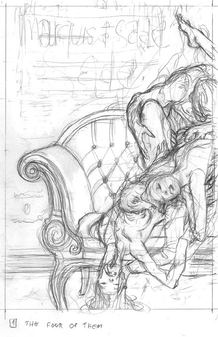
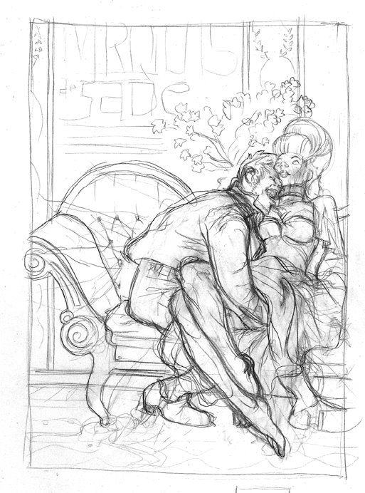
the cover had to be suggestive. it couldn't be too pornographic but also had to be loyal to the spirit of the text. these first two sketches are good examples of going over board, and then bellow board.

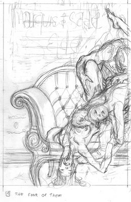
this one bellow hides more then it shows. having his hand up her dress could imply nasty things but in essence these are things that we imagine, nothing pornographic is actually drawn.
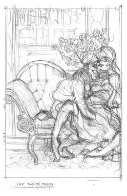
still there was a risk there, so this PG rated version was drawn, while completely loosing the soul or whatever it is that worked in the original doodle- the girl turned into wax, the man is Mr. Hyde.

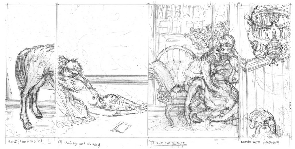
the AD was super, he kept pushing me to do 'my thing'-- basically to interpret it from the guts, no pre-constructed concepts. then he went out there and got the better sketch approved. Since the cover included a back cover and two flaps there was lots of space to build a rounded atmosphere. the back cover is essentially the 'later' of the front, the front flap showcases an evil looking chandelier and the back flap has an excited horse. hoping i could get away with something slightly outrages I had the back flap and back cover create a suggestive bestiality situation that was quickly cleaned up when the horse got circumcised to the client's request

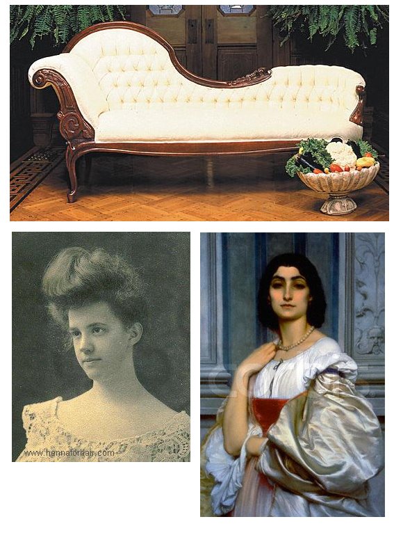
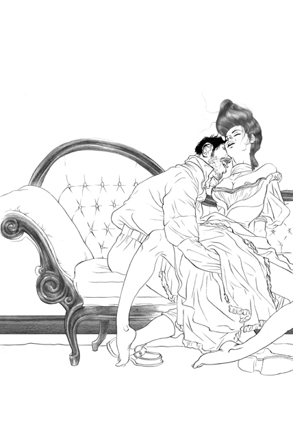
these are references i gathered during the sketch stage. i love the hair on this Victorian chick. I wanted to keep it minimal but give a good treatment to the elements that made it in. i rendered some parts with a pencil --the wood part of the coach, the hair, the wall panel. credit should be given here to the amazingly talented Zach Baldus who first showed me this technique and still doing it much better. the rest is ink.


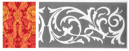
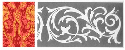
I used these patterns (both from Dover books) to create the carpet. the red one was a tile that took most of the space. the black and white strip was the frame at the edge of the carpet- then I distorted them in perspective. the interior reference is a Boudoir, where this book takes place. i wanted to bring the warm and stuffy feel it has to the cover.

after coloring and placing the patterns. (the type design here is just some general idea i laid down-- real designers will take care of it).
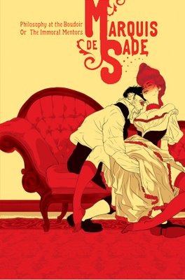
this is the entire cover- the other parts had a similar treatment, some pencil, some patterns- you get the idea.

finally, I urge you to have a look at these smarter interpretations of literary classics by some of today's leading cartoonists.