

asaf :: A quick quarter page for the Wall St. Journal, for a review of Bernard-Henri LEvy new book AMERICAN VERTIGO. from the article "The reader gets a chance to see how America looks to a European who is not unfriendly and who speaks with the verve and confidence of a philosopher who can write and a journalist who can think."
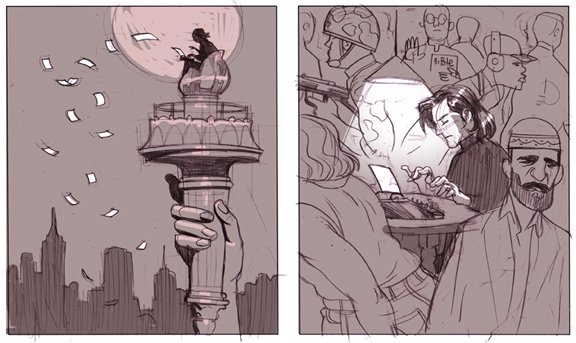
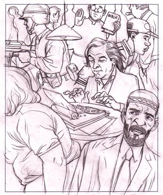
the sketches are opposite interpretations for the same idea - writing about america from within, while being an outsider. the AD decided to go with the crowded scene, I was mostly happy to work in black and white for a change.

very nice this balck and white illo.contemporary artwork in general, yours.
ReplyDeletei added your blog to my links to have a look every now and then if you don't mind
I like the faces in this one. They all have character, and asafness. And I also like those two figures in the front. Nice work!
ReplyDeleteBlack and white is very hard to do, I find. Yours is very well done.
ReplyDeletepiero - thanks :) you are welcome to visit anytime.
ReplyDeletenate - you got a point. it's probably because I am native hebrew speaker from tel-aviv, and hebrew is a language one reads from right to left, what might explain this error. it's not the first time it happens... I better watch out next time I draw a book!
the snowy image on your blog looks cold, really chilling. I like how the street invites you to go deeper into the image. the characters are well drawn, but personally I prefer the way you treated the architecture on this one. maybe it's the colors, I would expect the girl for example to have a happy colorful pattern on her hat - a warm touch in a cold world!
jed - thanks. "asafness" - that's interesting :)
eliane - I find it easier to work in black and white. when I work in color I often work the shades first then color everything on top of that. anyway - thank you!
Great illustration. Sometimes black and white tells the story more clearly.
ReplyDeleteI must admit I don't understand the art director. I would have given the green light on the other sketch. I just love the overall graphic design of it, and the multiple interpretations, as you say writing from within America, or as I like to see it, freedom of speech, the papers he's is writing are almost like sparks from the light of liberty. Current events here in Denmark might influence my perception, but it's a darn good idea. Great work.
thanks p.
ReplyDeleteI haven't seen the caricature that was presumably responsible for the unfortunate events that recently took place in Europe and elsewhere.
do you have a link ? I guess some people are more sensitive about their religious icons than others.
on a different note - great work on your blog and site. you are a true doodle artist.
You can find the cartoons at:
ReplyDeletehttp://blog.newspaperindex.com/2005/12/10/un-to-investigate-jyllands-posten-racism/
You should scroll past the first ones, the resolution is not very good... but the site shows the same cartoons at the bottom at much better resolution. (I don't know what the site is about, I found it through a quick search, so feel free to yank the link if they have dumb stuff on their site as well.
And thanks for the comments abut my site.
thanks for the link p :) interesting stuff.
ReplyDeleteawesome sketchesssss
ReplyDeleteI enjoy your work so much, I was introduced to you and Asaf through Bipolar which I followed with baited breath for the past few years. I've taken to frequently visiting your portfolios and enjoying this blog. Through all this devotion, I was pleasantly stunned to see your new book The Placebo Man at the Alternative Comics booth at the New York Comic Con last weekend. Why no mention of this new offering on the blog or your site? I look forward to reading it.
ReplyDelete