 tomer
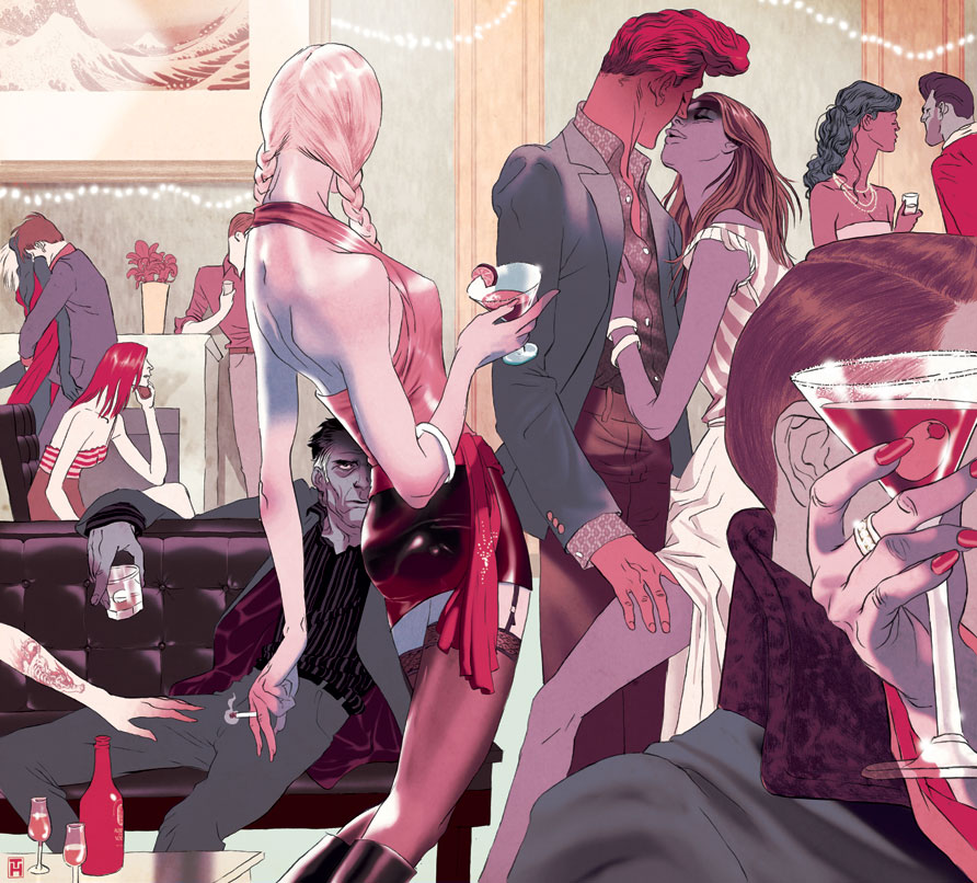
tomer :: the epic new novel from the highly acclaimed and always controversial author Michel Houellebecq examines, among other things, the trials of old age and the death of love. Playboy magazine chose an excerpt describing the breaking point of a devastating relationships between the aging protagonist and a super hot young actress half his age. the scene is taking place at her birthday party which is populated by her young good looking circle of friends...he can't win.
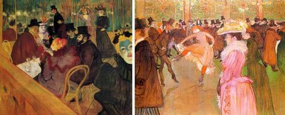
Toulouse-Lautrec is a great source for seedy party atmosphere. he also have a great way of 'controlling the crowd'-- giving an impression of a room full of interesting characters but not having it feel messy or over whelming, his focus is very selective.
the AD felt the sketch was missing something at the lower right corner and the empty space attracted too much attention to itself. this was solved with a cold martini.


 tomer :: the epic new novel from the highly acclaimed and always controversial author Michel Houellebecq examines, among other things, the trials of old age and the death of love. Playboy magazine chose an excerpt describing the breaking point of a devastating relationships between the aging protagonist and a super hot young actress half his age. the scene is taking place at her birthday party which is populated by her young good looking circle of friends...he can't win.
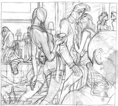
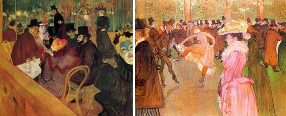 Toulouse-Lautrec is a great source for seedy party atmosphere. he also have a great way of 'controlling the crowd'-- giving an impression of a room full of interesting characters but not having it feel messy or over whelming, his focus is very selective.
 the AD felt the sketch was missing something at the lower right corner and the empty space attracted too much attention to itself. this was solved with a cold martini.
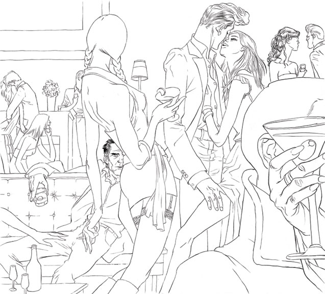

Two thumbs up from New York City - Kenichi.
ReplyDeleteNice figures, nice composition, but I'm particularly impressed with that trick where you did the texture of the hair and the scarf in pencil, really adds variety. I like these subtle textures--like the wall--instead of a gradient or an obvious textile you went for this really subtle and effective texture.
ReplyDeleteI think her ass is a little on the shiney side though--there's vinyl, and then there's titanium polished to a blinding sheen! You and those highlights! Even though it's a definate skill of yours, Just because you can doesn't mean you always should, and it's in such contrast to all of the other wonderful subtle stuff you've got going on in this piece.
But as usual, I love your lithe, effortless looking figures.
I like the painterly quality of the way you handled the woman's back. It's got a nice soft pastel feel.
Tomer, you need some variety in your pallette. A limited palette is one thing, but they don't always have to be the SAME colors. Next one, I challenge you to avoid pink alltogether!
Another excellent piece!
This looks really good, the Hollywood louche comes across really well. Any relevance to the Hokusai wave in the background?
ReplyDeleteThis piece has such a grand, tragic flavor to it. Jed, if you can imagine it as a 2-page spread, the shiny fanny works perfectly as the focal point. The protagonist's craggly face is the perfect foil to those bright globes of ass-dom.
ReplyDeletemmm, interesting point. And it does draw your eye right to where we're supposed to look, the guy on the couch. So yeah, it is a focal point, and more importantly, helps direct the viewer's eye to the protagonist of the story who might otherwise get a little lost in the crowd.
ReplyDeleteSometimes I forget that illustration isn't just about pretty pictures, but about getting your message across clearly (and in the case of magazine illustration like this, as obviously as possible), and yes, this is what this does.
I admit a predjudice against these kinds of ultra polished surfaces and highlights. I think recently Tomer's done this a lot less in his work, and has gone for a softer approach to modelling, which is very well represented here in the women's back.
And let me clarify my position on pink: I like pink, like the way Tomer uses pink, but sometimes it seems to be his default palette. James, you do this with grey, but I think that it works for you, because grey is a neutral color by definition. Your pieces often end up in grey tones with these wonderful accents of color, and it's an effective approach, which emphasizes your beautiful draftsmanship. I wish I could draw as well as either one of you.
Tomer has a really wonderful and complex grasp of color, and tends to very effectively distill his palette to the bare essentials, usually an analagous scheme that suits each particular piece well in mood and tone. But lately, or at least in these last few pieces, that seems to involve a lot of pink, when pink may not always be the best choice.
II think both Asaf and Tomer deserve all the praise they're getting, but sometimes I miss a more well-rounded (but constructive) critique of the work. My opinion certainly isn't authoratative, or even necessarily always on target, but the praise sometimes ends up sounding repetitive and indescriminate, and may not always be to either artist's best advantage.
Ideally, one of the great purposes this kind of forum can serve is to make all of us better artists, so, maybe selfishly, I'd like to invite more genuine critique, if Tomer and Asaf will allow it. Maybe that's not the purpose of this blog, and I don't want to impose my own agenda--I really enjoy seeing the evolution and development of each piece, and have already learned a great deal simply from that. But I also would enjoy hearing more of a range of opinions.
hey Kenichi! - thanks for stopping by...I whish I was in NY right now.
ReplyDeletejed - we started this blog so we can share our daily routine as working illustrators. I check out a bunch of blogs everyday, i find it interesting and sometimes inlighting. sometimes even inspiring. but we don't kid ourselves thinking this is a critical think tank or even a private illustration class. of course, all opinions are welcomed and encouraged (sorry we had to delete the marriage proposals (mostly from dudes)) but we really don't expect anything. we enjoy the comments and hope whoever end up at this url find it at least mildly entertaining.
and about the pink- i go through a certain color every few months, exhausts all usages i can come up with and move on. color dejour is pink, before that it was green, for a long time it was blood red and so on. in a way it's the most autobiographical element of my work. so yeah, you can say I've been feeling pink lately.
nick- the Hokusai was chosen purely on a visual basis cause it continued the 'wave' the little lights created. i glad someone noticed it's there though!
jj - so right about the focus on her ass high-lights being very deliberate and crucial for how one reads the picture. if only i could be as eloquent.
chris- hey tnx! looking forward to the final of the chuck renaud art...looks promising.
"think tank" isn't quite where I was headed, and I'm not exactly looking for a classroom, but I do try to consider critically what I'm looking at as much as I can.
ReplyDeleteI do think I have something to learn from you and other people in an informal way, and part of that, for me, is discussion.
I think I do have habits that have carried over from my schooling in how I look at things, and I don't think they're negative habits, but critical ones, and I know you don't expect some kind of thorough critique of your work (something I hope I'm not offering), but I do have things to say that I hope are valuable in some way. Again, informal, casual, and usually pretty impulsive, as I'm just as likely to change my mind if someone has something insightful to add, like James comments for instance.
And I like to hear peoples reasons for things, like your reason for pink. When someone challenges my ideas, it makes me think about why I think them, and how I come to some of my decisions. What's wrong with pink? Or shiny surfaces?
So all I meant to do was encourage people to challenge my ideas and make me think, which I thought, since it entertains me, might also be at least mildly entertaining for them as well.
But then this blog isn't about me is it?
one of the best illustrations I've seen you do. like james, I enjoy the shiny ass... great blog
ReplyDeleteI'll just have to echo that last comment. This is outstanding. Love it to bits. And the hair-do of the middle (standing) guy is to die for. Wow!!
ReplyDelete/ Jakob
Tomer, you surprise me each time with your bold use of stretched monochromatic palettes.
ReplyDeleteThis work is really amazing.
Thanks for sharing.
Greetings from Israel.
josh- I've enjoyed every update on your site, maybe it's time to start a blog and tell us all your secrets...? pls consider.
ReplyDeletejakob- we'll always have pink. that sounds wrong.
idan- thanks for the kind comment :)
I'm a long time reader, first time commenter :P and just wish to compliment on the great work your guys are doing. It's great to see the process of illustration from intial sketches to final composition.
ReplyDeleteGreat piece tomer.
ReplyDeleteOh my goodness your work is just amazing my mouth dropped open when the page popped up your lighting and drawing skillz are just supreb and the subject matter is so rich of life and the real issues we face as humans day 2 day I love your work I 'm going to add u to my links if that's okay and I love it if u could take the time to stop by my blogs at http://henchpekaso.blogspot.com/ and my life drawing blog at http://drawnfromlife.blogspot.com/ I'll be sure to return here very soon to see more of your wonderful work!!!!
ReplyDeletehey q- I use regular ink and brush for the line and Photoshop for the colors, so no freehand or illustrator.
ReplyDeleteed- glad to hear you enjoy the process, and thanks for posting.
jon- thanks :)
st john- hey i just checked out 14A and those characters are excellent--I dig the monsters allot though they all have a great abstractions and seem to burst with personality. thanks for stopping by.
My favourite so far. The characters are perfect. Have to love the pink hair of the dude kissing!
ReplyDeletetomer, how's things man? your work is still badass.
ReplyDeleteI saw this piece in Playboy, and it looked great! It's cool to see the process and the finished art, then see it in it's final published form.
ReplyDeleteKeep putting out great stuff here! My favorite part of this blog is how you break down each element of the creative process, and what influenced it (especially the Maquis de Sade piece). The step by steps format is fantastic.
Thanks!