
Friday, December 02, 2005
in-laws :: final
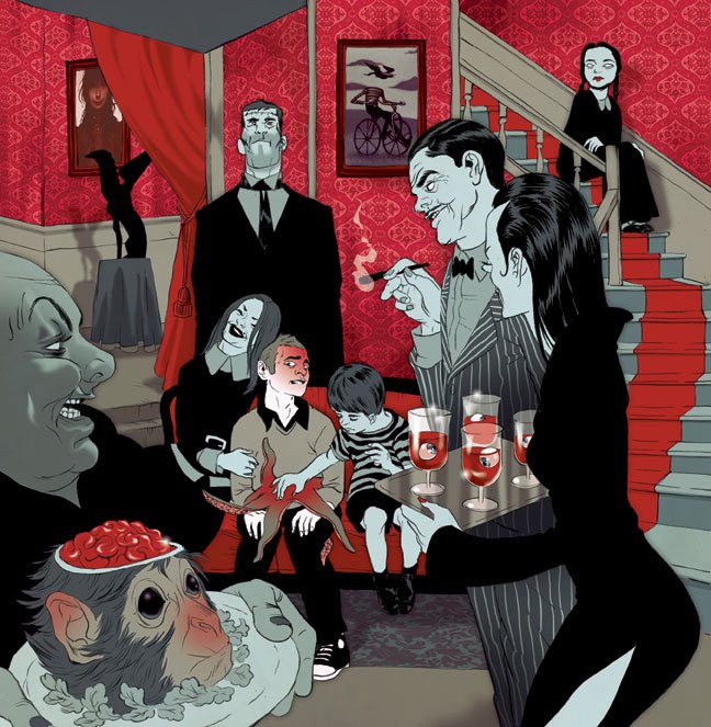
tomer :: on my third year at SVA I was lucky enough to study under Tim Bower who had some great pointers, among them :: think of gray as color :: gray is being largely overlooked when in truth it works so well in almost any palette. also, dealing with a rather cluttered composition I wanted to have the viewer attention falls straight on the son-in-law and so made sure he's the only pure white in the image. you'll probably notice the gorgeous art on the walls- these are real paintings done by my pal esao who is an amazing painter and a generous human being to let me use them here. the bald headed guy in the front is the 'host' of this image, it's over his shoulder that we take a peek at the scene, either him or the monkey brains.

Subscribe to:
Post Comments (Atom)
Hola, i'm Marina a fan of you from Argentina , i discover your old site some time ago, and i always take a peek( sorry for this clumsy english), a question : How do you work in the range of colors, it is at random when you start a new project? You work whit a predefinited pallete? I assume that you have Photoshop,and i like the pallette you use, acid colors, and the skin tones so rare... like an oppresive and acid mood. Thanks for your art!y Saludos.
ReplyDeleteThis turned out spectacular!! Love to hear the reasoning behind the colors as well. I can also tell it's working and that you have achieved the effect you were aiming for. It's really cool to see the leaps you're illustrations take from ink to color.
ReplyDeleteI'm curious about one thing. How does doing editorial illustrations compare to comic book covers financially? I have some insight into the editorial side but none in comics. I'm not expecting any figures, but I wonder if it's worse, equal or better fees in comics.
That looks great. It is nice to see your rough and inking.
ReplyDeleteHey Tomer!
ReplyDeleteYour work is still so lovely, and this blog site is so generous of you.
Merry Christmas to us, then, huh?
:)
Autumn
I really like how you color with a limited range of hues, yet manage to create the illusion that you used most of the spectrum.
ReplyDeleteanon- hola Marina! I look for a good pallet when I'm looking for reference. if i find a fragment of picture or and old comics or anything really where i think the color combination would be right for what I'm working on (it doesn't matter what's IN the picture) i will use that as my palette. when all the colors already exist on the same printed surface it's like they 'got used to each other' somehow... just scan it and use the color picker.
ReplyDeletejakob- i think pricing in comics can be individual but from my experience a cover in comics would pay like a full page in editorial i.e less then magazine/book cover. BTW the girl power set is damn sexy...it's amazing how the color of the type in the back sets a distinct atmosphere for each figure.
dan- thanks dan!
autumn- autumn!! thanks for stopping by! hopefully we'll meet again before next x-mass... NY is like a cruel magnet. we think about you all the time.
shay- thanks :) i always start very colorful and reduce from there. i think 90% of coloring is editing out what is not absolutely necessary.