
Thursday, August 31, 2006
Wednesday, August 16, 2006
deliver :: the marketing war
tomer :: Deliver is a magazine produced for the u.s postal service. it deals with issues of direct marketing and the benefits of using mailings to create effective and personal campaigns, unlike TV spots that tend to be very general and over the top. the amount of time spent watching TV by the average American is consistently declining and alternative ways are (re)emerging.
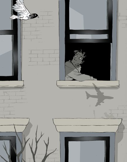
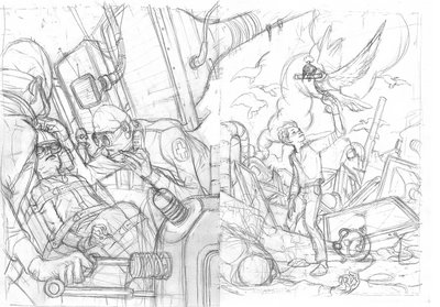
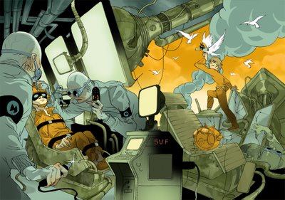
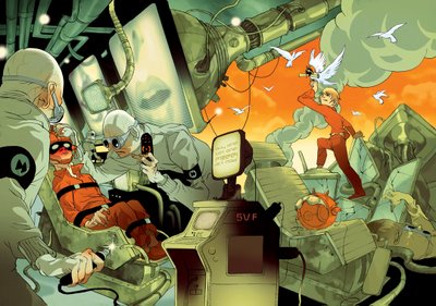
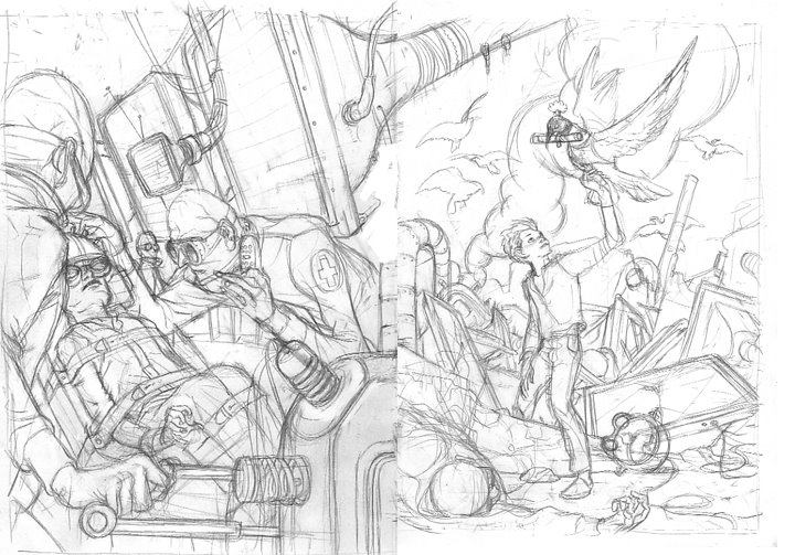
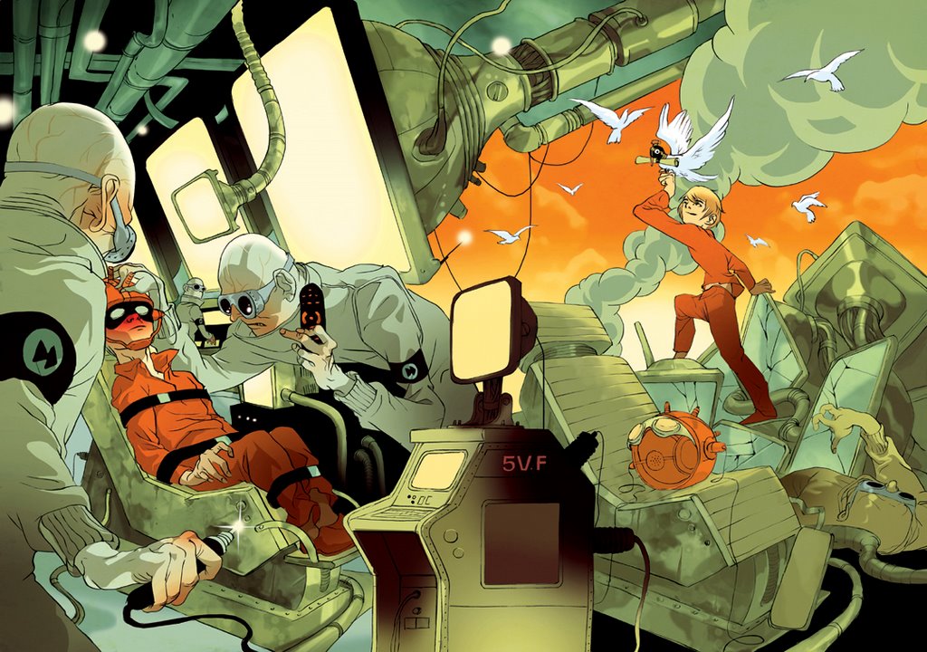
giving the subject a si-fi bent, a concept was cooked in which a boy is forced by corporate scientists to watch big screens and when he escapes his captures, a mail dove greets him to freedom. the client stressed that the front and back covers needed to continue the same space so it was a bit tricky getting a time continuation established. these are the initial sketches:

realizing it to a full size drawing it seemed the movement in the composition went nowhere.
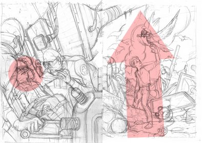
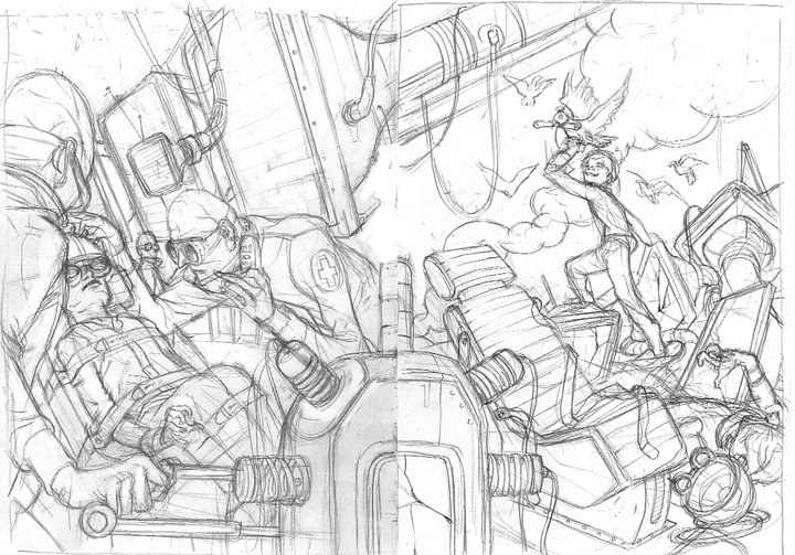
so the front cover was replaced, this time trying to work a diagonal in there that will interact with the back cover.
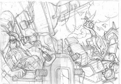
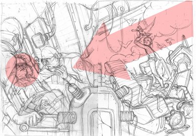
once this was approved the drawing was rehashed on a nicer paper and inked.

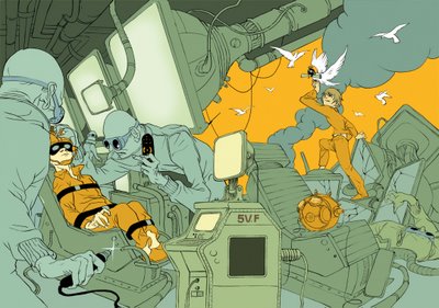
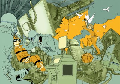
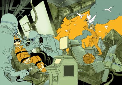
this bellow is the coloring, broken into a few stages. in reality it took much longer then it'll take you to scroll thorough them, and the color combo changed numerous times.

giving the subject a si-fi bent, a concept was cooked in which a boy is forced by corporate scientists to watch big screens and when he escapes his captures, a mail dove greets him to freedom. the client stressed that the front and back covers needed to continue the same space so it was a bit tricky getting a time continuation established. these are the initial sketches:

realizing it to a full size drawing it seemed the movement in the composition went nowhere.

so the front cover was replaced, this time trying to work a diagonal in there that will interact with the back cover.

once this was approved the drawing was rehashed on a nicer paper and inked.

this bellow is the coloring, broken into a few stages. in reality it took much longer then it'll take you to scroll thorough them, and the color combo changed numerous times.


Thursday, August 10, 2006
fragments vs. anecdote
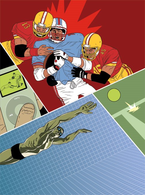
asaf :: another piece for PC Magazine. this time the article was about Pro Athletes and how technology has affected sports on the field - both in the way the games are played and the way pro athletes train.
my basic idea was to somehow overlay digital elements on an intense moment in sport, more of a collage than narrative composition.
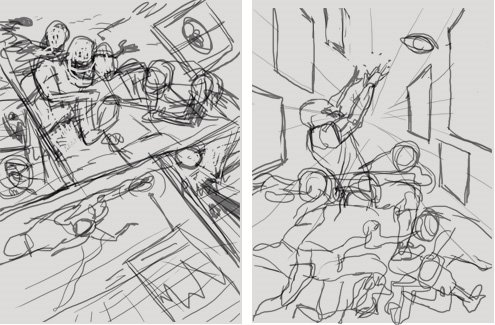
I started out with 2 thumbnails.

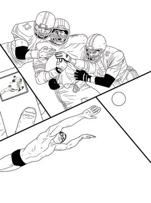
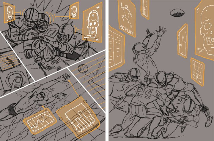
then reworked the sketches to a readable level. the sketch on the right is the traditional anecdote, a detail telling the story. the one on the left is a collections of different moments in sport, telling the story in fragments.
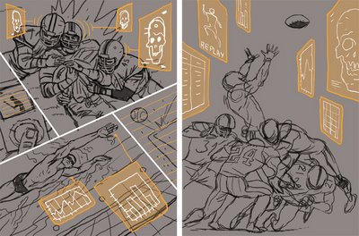
for the illustration concept, usually I go for the anecdote - one detail/moment from the over all story, represented as a visual metaphor of a textual content. since in this case the fragments concept was chosen, the challenge was to make the different parts work together.
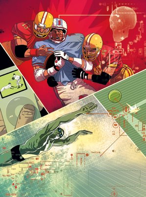
as I started coloring the different parts I tried giving each frame it's place on the hierarchy of importance.

finally, some color balance and dropped the hi-tech pattern on top of everything.
maybe I just miss doing comics.
my basic idea was to somehow overlay digital elements on an intense moment in sport, more of a collage than narrative composition.
I started out with 2 thumbnails.
then reworked the sketches to a readable level. the sketch on the right is the traditional anecdote, a detail telling the story. the one on the left is a collections of different moments in sport, telling the story in fragments.
for the illustration concept, usually I go for the anecdote - one detail/moment from the over all story, represented as a visual metaphor of a textual content. since in this case the fragments concept was chosen, the challenge was to make the different parts work together.
as I started coloring the different parts I tried giving each frame it's place on the hierarchy of importance.

finally, some color balance and dropped the hi-tech pattern on top of everything.
maybe I just miss doing comics.

Thursday, August 03, 2006
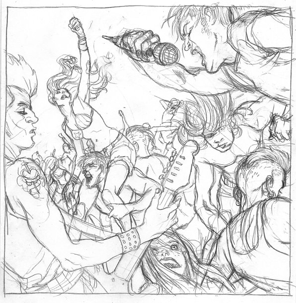
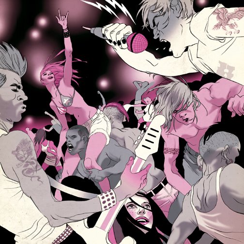
lollapalooza :: rock n' rave
tomer :: this smallish 6x6er was created for the Chicago Tribune about Lollapalooza, the famous three day long rock concert. the brief went for atmosphere rather then any specific band and my initial idea was to flip the classic composition of a band in the center framed by endless crowd -- so you get the crowd in the center, framed by the band.


Subscribe to:
Posts (Atom)