

Wednesday, November 30, 2005
the in-laws :: sketch
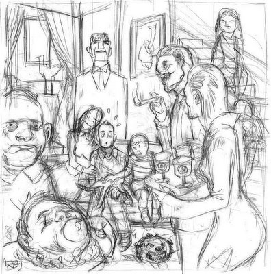
tomer :: an article in Men's Health advises potential husbands how to be the perfect son in law. after sketching a group of people wearing matching sweaters and one guy sticking out with a different pattern sweater the art director explained that since the article isn't extreme in any way (it's pretty funny though) she wanted to take the 'son-in-law' relationships to crazy place and so, make the whole package more attractive. we discussed an idea of having the parents aliens but eventually decided to go with the ready-made fan favorite weirdoes-in-law :: the Addams Family.
DJ Dask :: sketch
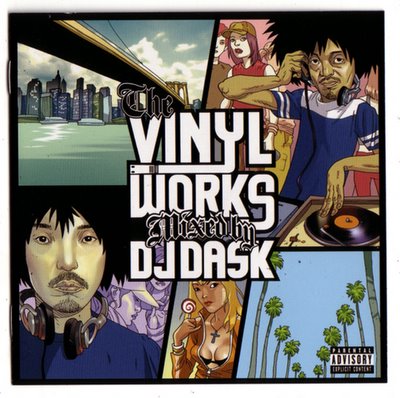
asaf :: couple of months ago I was asked to illustrate the CD cover for DJ Dask Vinyl Works.
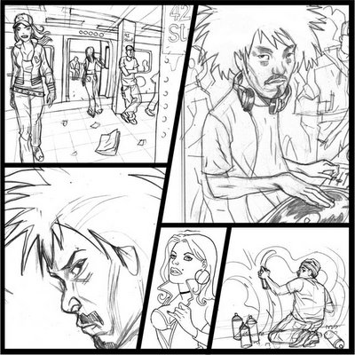
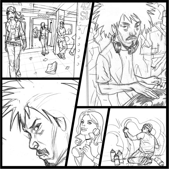
Triple Seven Records wanted something similar to Playstation's Grand Theft Auto, in terms of composition and over all atmosphere. now, a second collection is about to be released, and I was asked to do the same thing, only a little bit different.
here is the first cover illustration, and the sketch for the second one.

Tuesday, November 29, 2005
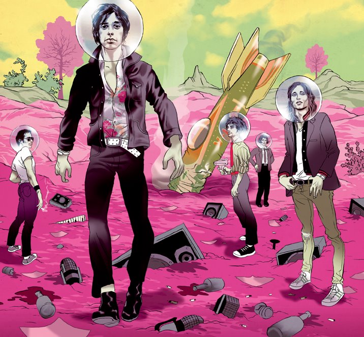
the strokes :: final art
tomer :: using that star trek screen shot as a starting palette I tried keeping the background fantastic enough to contrast with the mostly gray strokes and gray music related objects buried in the ground. at some point whatever I'm coloring becomes pink and in this instance it's where I had to stop. note the rocket in the back functions as a crashed phallic symbol.

Monday, November 28, 2005
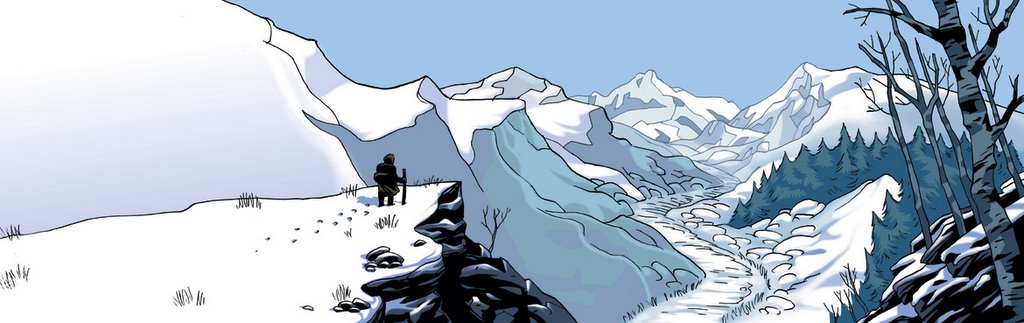
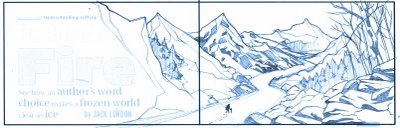
yukon trail :: final
asaf :: the art director decided to go with the first sketch. I tried using mostly "cold" colors - a range of blues, with the occasional green and violet. oh yea, and a lot of white.

the strokes :: 2nd sketch
tomer :: the art director doesn't feel this approach was compatible with the band's vibe and suggests a more gritty si-fi look (like the Matrix or Blade Runner). we discuss my original idea of them sitting in the main-deck only make the ship super rusty, dirty and with exposed cables everywhere. also, he feels that people might assume the star trek uniforms are a 'new look' so we should keep them in normal hipster uniforms instead. i redraw the first sketch and another very rough one of the main-deck idea.

the strokes :: sketch
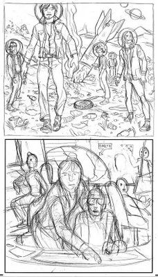
tomer :: Spin magazine is running a review of the new Strokes album called First Impression of Earth. the name sounds like vintage si-fi and I started looking for images of the original Star Trek ship, specifically scenes in the main deck. my initial idea was to place them with the uniforms and a big screen showing earth as if they are about to visit this new planet. while researching I bumped into this screen shot that blew me away. it's has a perfect composition, atmosphere and colors...and they look just like a band.
 and the sketch ::

 and the sketch ::
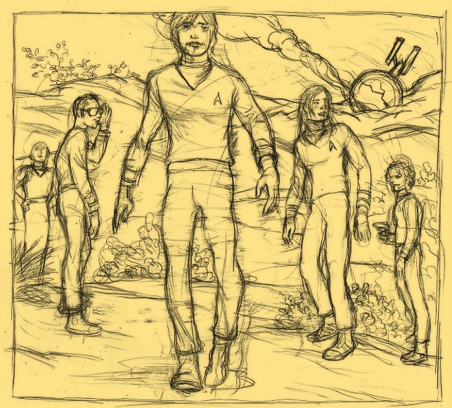
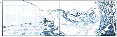
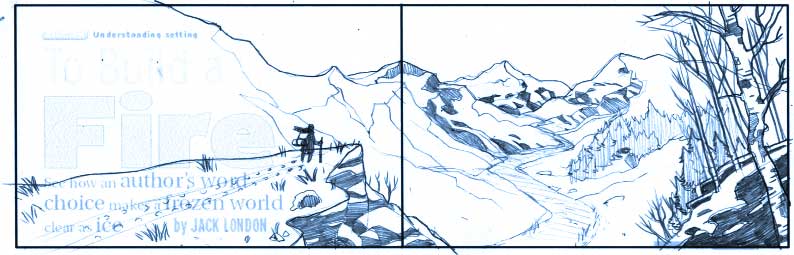
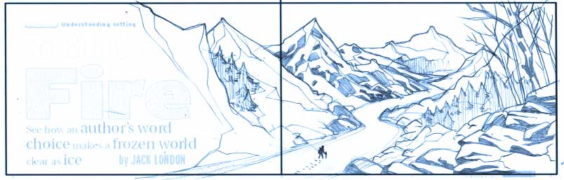
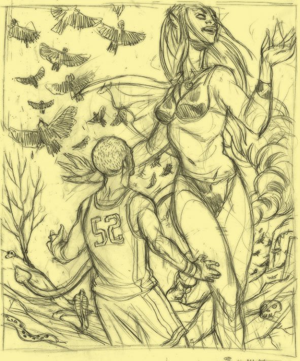
yukon trail :: sketch
asaf :: Scholastic Scope asked me to illustrate Jack London's description of the icey Yukon Trail. this time the landscape is the hero, and it is mostly white. big empty space on the left side for the title. with the sketches I tried two directions - one with the character looking at the trail from above and one where he is walking in the trail. its the usual watching/participating dilemma.
Sunday, November 27, 2005
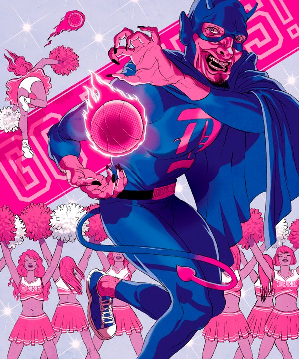
dancing with the devil :: final art
tomer :: since this is a story about collage sports I've added the banner in the background that wasn't planned in the sketch. sometimes design elements will pop up during the color stage mostly to cover my fear of empty spaces. the dominant blue is Duke's color and the magenta seemed to compliment it.

Saturday, November 26, 2005
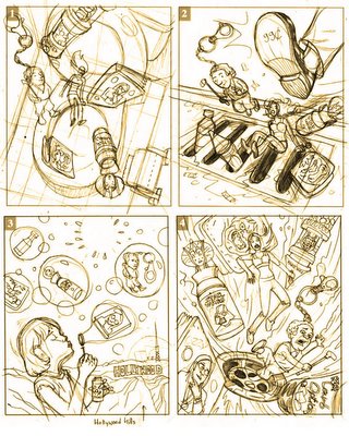
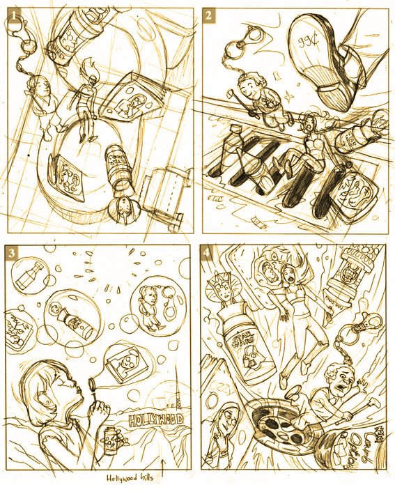
99¢ :: final
asaf :: here is the final, based on sketch #4. The colors had to be close to the photo reference of the real objects, so I only got to be creative on the water bubbles.

dancing with the devil :: sketches
tomer :: for ESPN about Duke university having the dominant team in the league, and playing off it's mascot, the Duke Devil, they came up with the title 'Dancing with the Devil'. two different interpretations bellow.


Friday, November 25, 2005
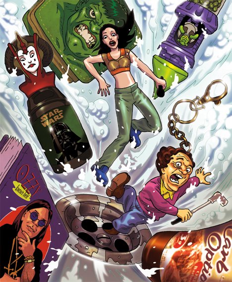
99¢ :: sketches
asaf :: "The 99¢ Only Store is honest. It's absolute. It's astounding in its simple and accurate measure of what, at the moment, is circling the pop-culture drain. When you're hot, you're hot. When you're not, you're offered ignominiously to deep-discount shoppers for less than a buck."
the problematic of dealing with this kind of subjects is the fact the "hero" of the illustration has to be an object, or a group of objects. this is hard since people tend to identify with their reflection -- human characters. LA Times magazine asked me to use some specific objects, such as shrek 2 M&M minis dispenser, spice girl figurine, stooges keychain etc.
here are some sketches for this concept -
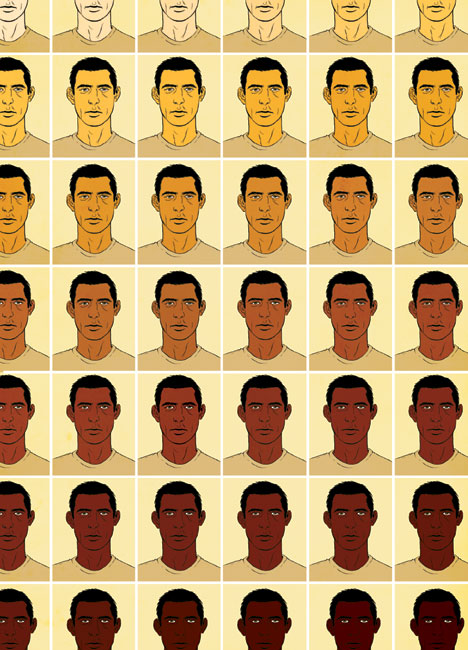
paranoia nation :: test yourself
tomer :: I'm one of those guys with olive skin, permanent five o'clock shadow and thick eyebrows. yes, you'll see me at a train-stop and get a bit worried. if I saw me at an airport I will likely, against my better judgment, get a bit suspicious too. I get stopped by security guards plenty, sometimes four-five times in one trip. I don't blame them. it occurred to me that each of us has an internal visual judge that categorizes whomever crosses our path based on a variety of parameters most of which are deeply personal, some are political, none are objective. we all have a 'zero' point -- where a person's appearance crosses too many 'red lines' and he becomes a 'suspect'. crossing a red line can be as slight as 10% more magenta in the general mix. this drawing wants to mess with your internal judge, making it look for that zero point-- it's natural tendency-- without quite reaching a concrete conclusion.

Thursday, November 24, 2005
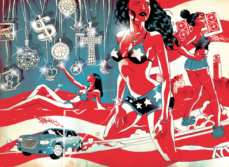
Urban America :: Final Art
tomer :: there wasn't much to struggle with color wise, so i tried giving it some scratches, pealed off paint and a slightly decayed surface feel to set the gritty urban atmosphere. the buildings in the far right are a manipulated photo and this car is apparently very popular with rappers.

Wednesday, November 23, 2005
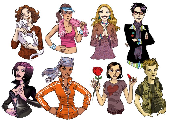
girls :: final
asaf :: the coloring was pretty simple - flat colors with one shading layer. these are going to be printed rather small, so it has to stay clear, and that means no textures/special effects/shineing details. sometimes it's harder to decide what not to draw, then to draw everything that pops up your sleev.

Urban America :: 2nd Sketch
tomer :: the 1st sketch was rejected...they felt it was overtly political. also, the flag got lost as the formal shapes of what the flag is made of where no longer recognizable. this is the 2nd round --more hip-hop-centric. jewelry, hot babes, cars.


girls :: sketch
asaf :: this is a series of girls for Men's Fitness Magazine : romantic, sophisticated, athletic, hippie, sex kitten, tom boy, stay at home and urban in no particular order.


Tuesday, November 22, 2005
Urban America :: sketch
tomer :: King Magazine asked me to redesign the American flag utilizing urban/hip-hop elements. there is a slight militant feel (the helicopters and shotgun) and i thought placing it in a Gas stop would be rather appropriate. the girl is wearing Adidas shoes and big sunglasses and a trucker hat--- the hat might be too indie rock but i think the rest are hip-hop, though these two are getting dangerously close and at some point will probably switch places just to stay ironic.


Monday, November 21, 2005
Cassidy inks
asaf :: here is the inked page. i used a mix of pen, brush and rapidograph on this one. and black indian ink.


Sunday, November 20, 2005
Y Gen final art
tomer :: this was modified from the sketch to some extent - the Y on the vest was too 'Yale' and his expression a little off. had a bit of a struggle with the colors too-- so this is the second version. the first was rejected.

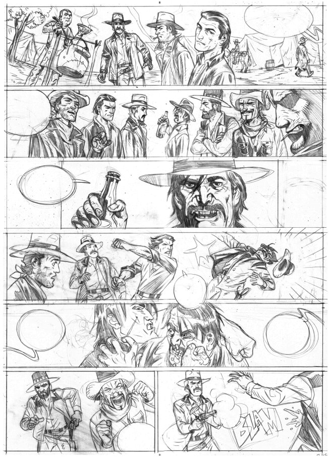
cassidy pencils
asaf :: "The Legend of Cassidy" is a comic book series written by Roger Martin, published by EP Edition (france). I have just finished illustrating the second part few days ago. here is one of the pencilled page.

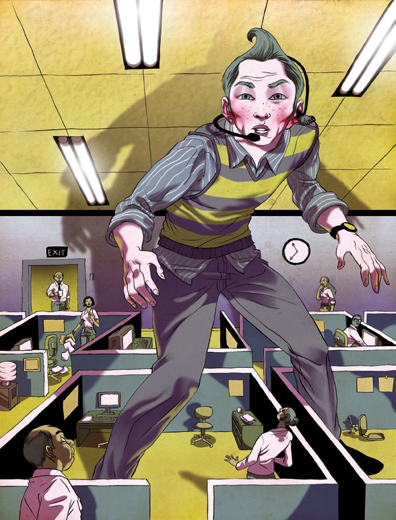
Y Generation dude sketch
tomer :: for Fast Company- a pretty interesting article about a new breed of workers and it's effect on the ever changing work invoirenment. that's that for the gen-xers by the way. they had a pretty good run for a while though.


alienation final
asaf :: the color palette resemble something of a candy store. can't say it was intentional, but when you think of it, prescription drugs are not that different.

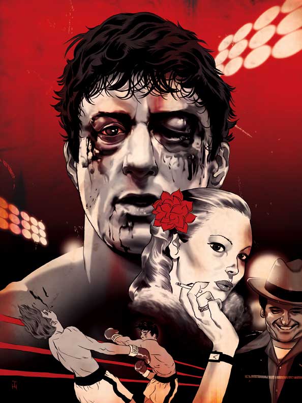
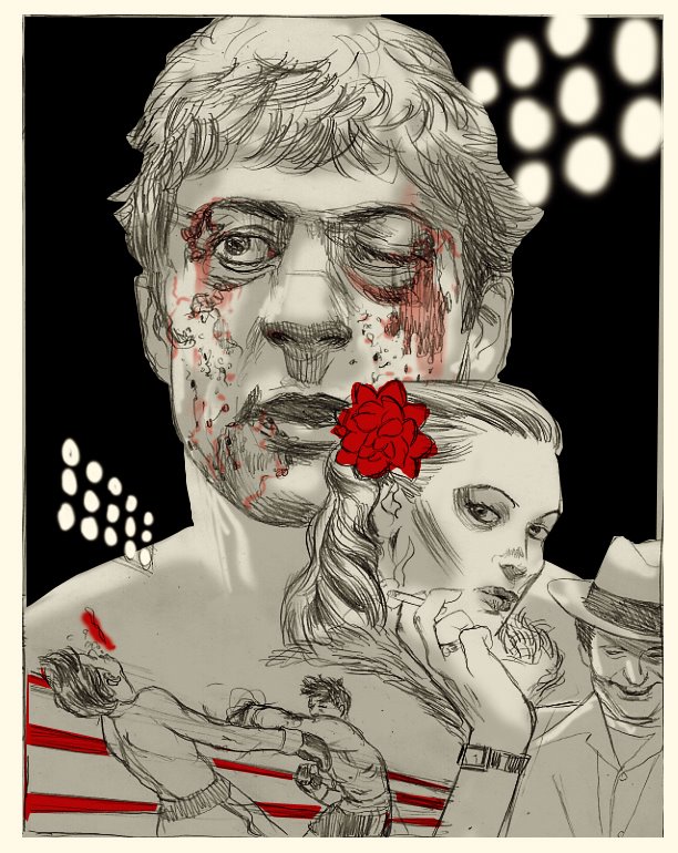
Raging Bull final
tomer :: here is the final image. it's in the latest Entertainment Weekly. the likeness was a bitch- it's a young Deniro with a prosthetic nose and a black eye..

Wednesday, November 16, 2005
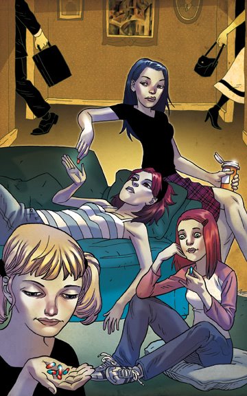
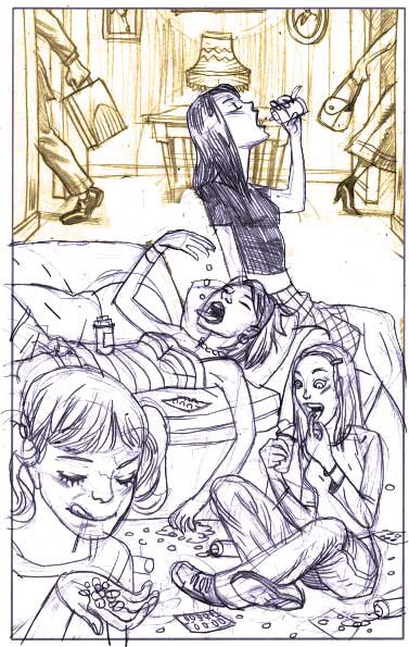
alienation
asaf :: this sketch was done for Girls Life Magazine, for an article about teens consuming prescription drugs. the theme is not entirely different from another job i did for U.S. News and World Report, dealing with alienation of teenagers in home surrounding. i am trying to create it using two different color palettes for the foreground and background.

raging bull
tomer :: a sketch for Entertainment Weekly covering the new Raging Bull dvd. a pretty straight portrait of a young Deniro with a banged up face. the movie is in black and white and the AD thought it would be a good idea to keep the pallet limited- black, white and red. the character Deniro plays in the movie seems to go through life like an explosive violent (and paranoid) ball of anger. i wanted a confrontational setting with a bit of an old movie poster composition.

Subscribe to:
Posts (Atom)